Client
Typography / editorial poster concept
Typography • Poster Design
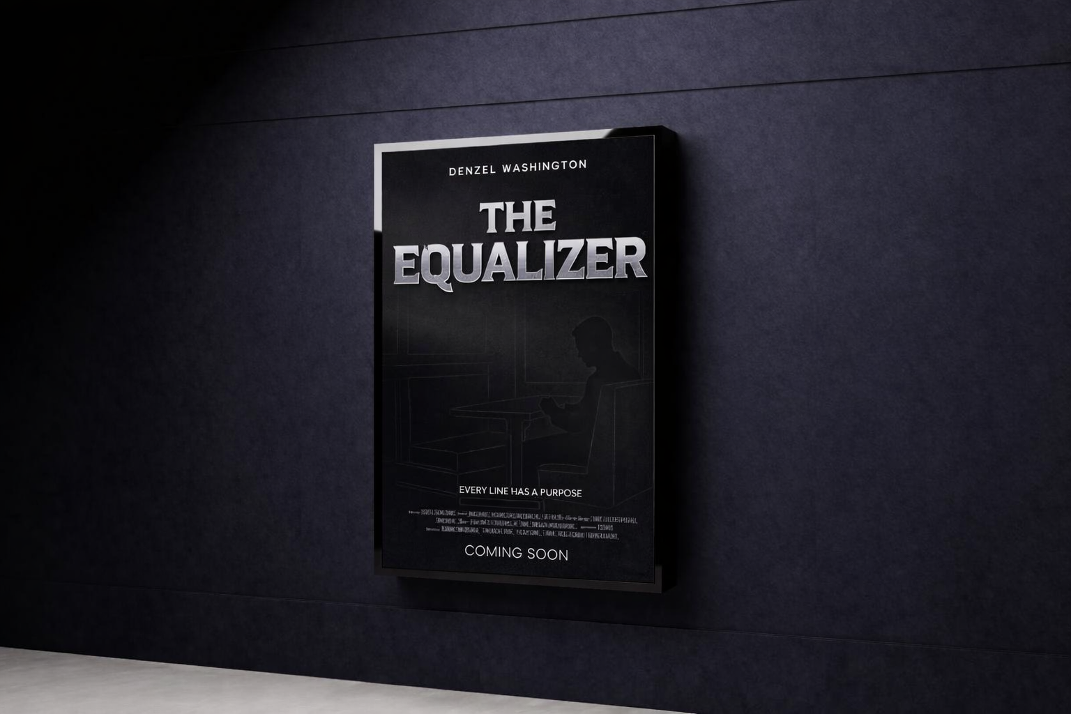
A typography-first movie poster designed to create cinematic tension through hierarchy, spacing, contrast, and restraint.
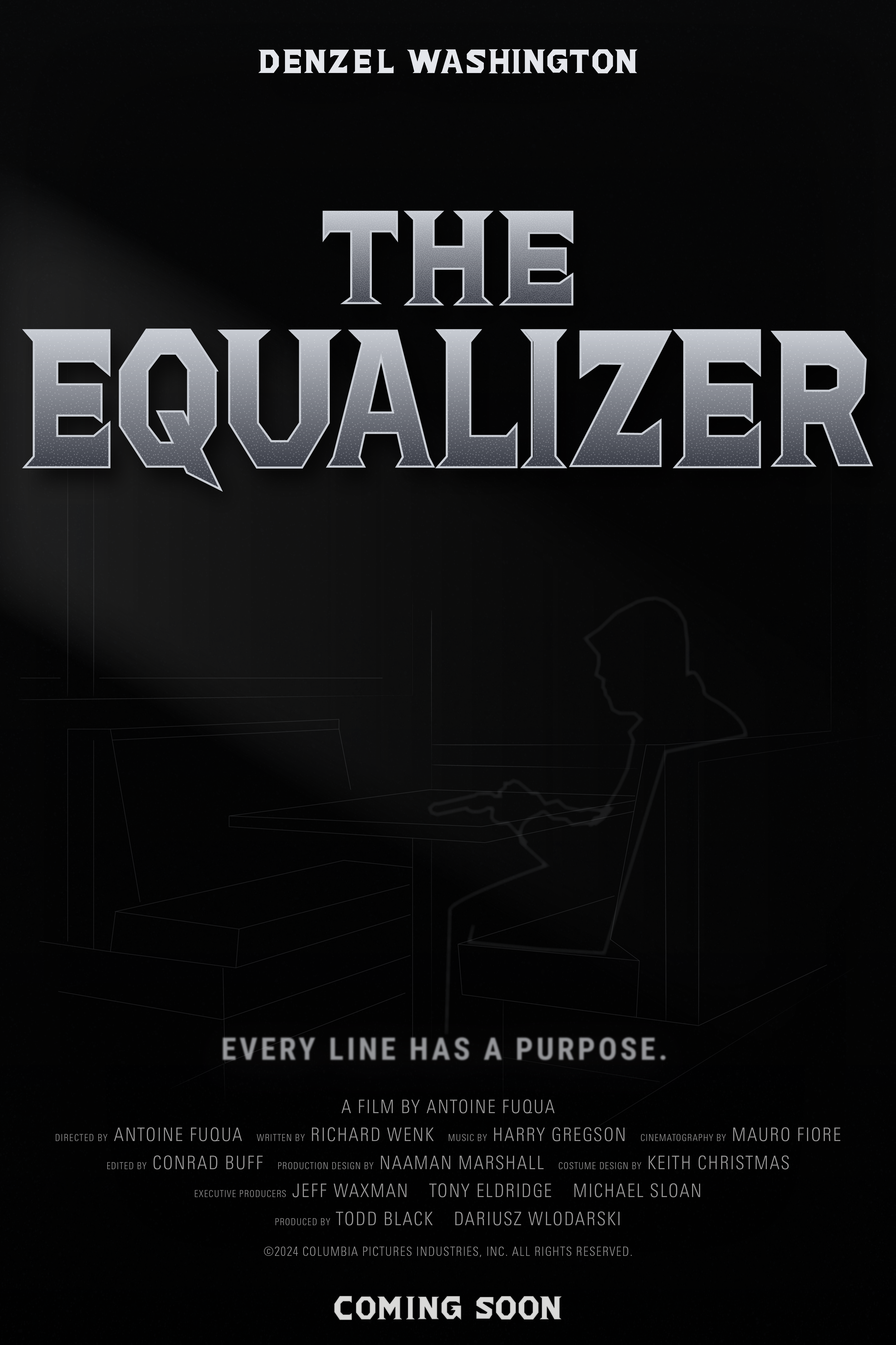
The final piece leads with the strongest visual result first, showing how typography, scale, and spacing were used to create a poster that feels dramatic without becoming visually crowded.
The title treatment dominates the composition while the darker base and supporting details keep the overall read controlled and cinematic.
The project needed to create suspense and mood using very limited elements. Without relying heavily on imagery, the layout had to use type, balance, and negative space to guide the eye and make the poster feel cinematic rather than flat.
The final poster communicates drama through typography and composition alone, showing a more restrained and editorial way of creating impact.
The process focused on hierarchy first, then mood, then refinement. Instead of decorating the poster, the goal was to make every typographic and spacing decision feel deliberate.
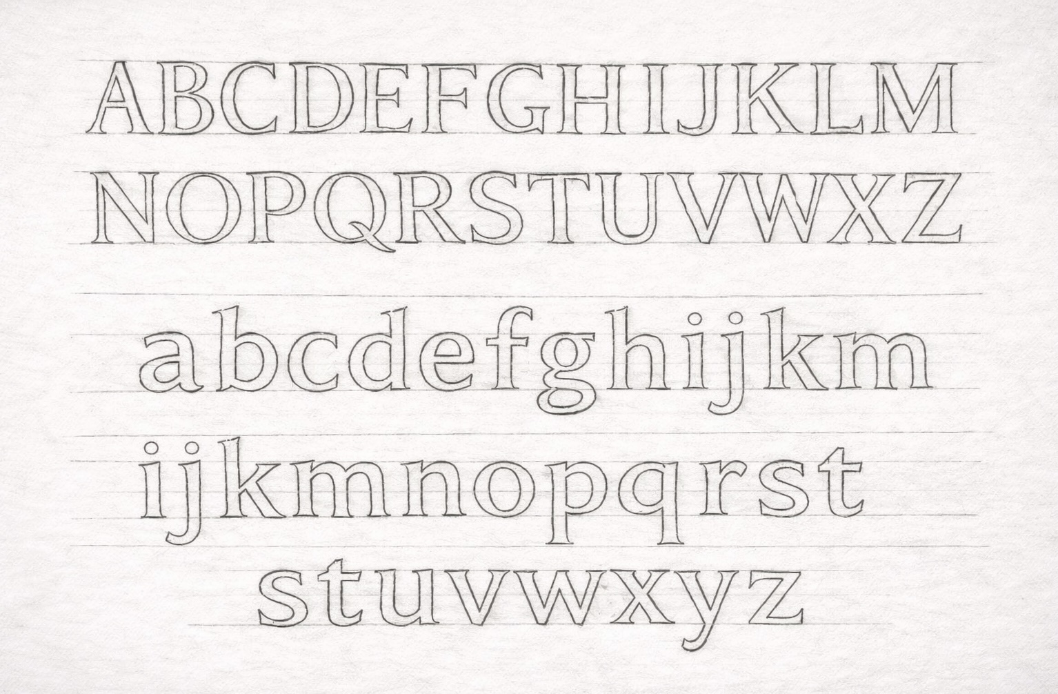
Early process sketches were used to test hierarchy, alignment, and the overall reading path before refining the poster digitally.
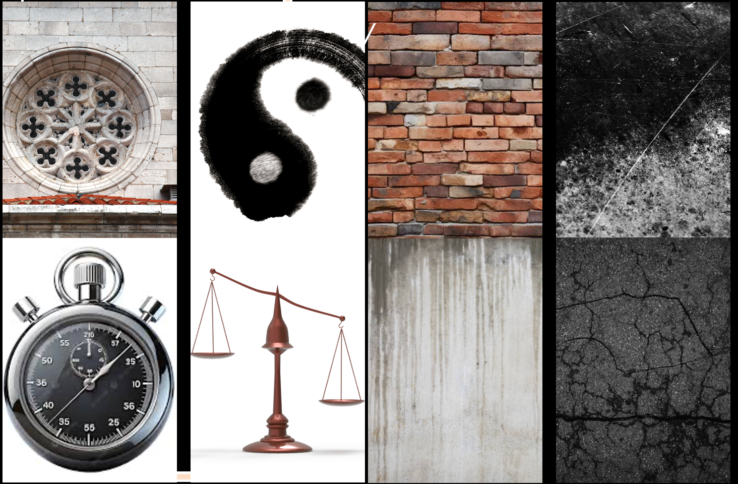
The moodboard helped establish the darker tonal direction and ensured the poster would feel cinematic rather than overly decorative.
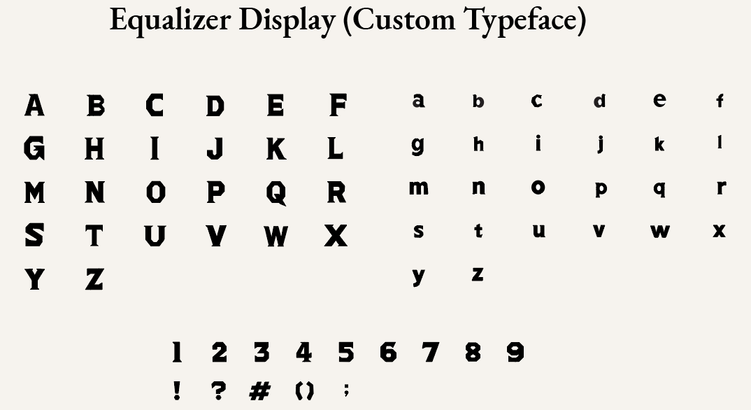
Spacing, scale, and typographic detail were refined so the final poster would feel sharper, more controlled, and easier to read at a distance.
The poster applied in a real-world setting to show scale, readability, and how the typography-led composition performs in an environment.
Showing how the poster reads at a larger scale and how the typography holds attention in a physical environment.
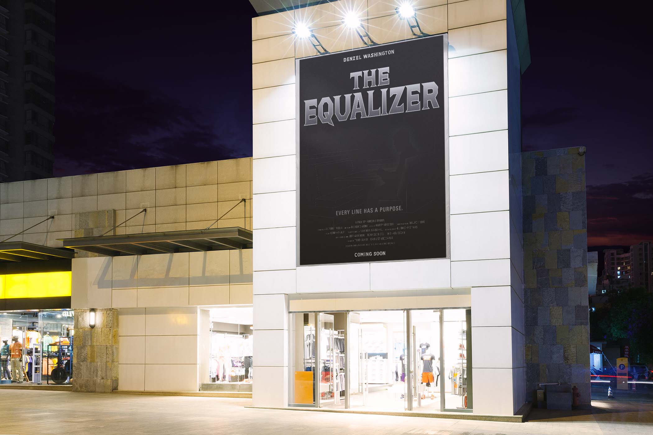
The darker tone and strong hierarchy help the poster stand out in a busy public setting.