Brand idea
Unity, culture, quiet confidence
Brand Identity • Fashion • Editorial Direction
ISOKAN is a luxury fashion identity inspired by unity, culture, and quiet confidence. The project explores how cultural meaning can be translated into a modern, minimal brand system.
ISOKAN was developed as a fashion identity that uses minimal design to express deeper cultural meaning. The intention was to create a system that feels calm, confident, and refined rather than loud or overworked.
The system was built to feel wearable, editorial, and premium. Every decision around typography, spacing, image direction, and applications was meant to support that tone.
The final identity combines structure, tone, and storytelling so the project feels like a complete fashion brand rather than a standalone logo exercise.
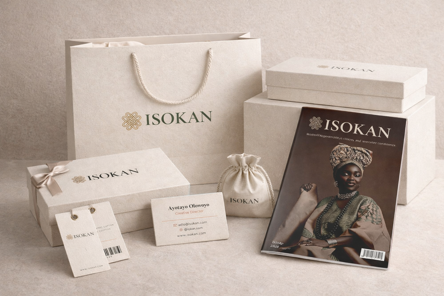
The final logo suite was designed to stay strong across fashion touchpoints, from tags and packaging to editorial and digital use.
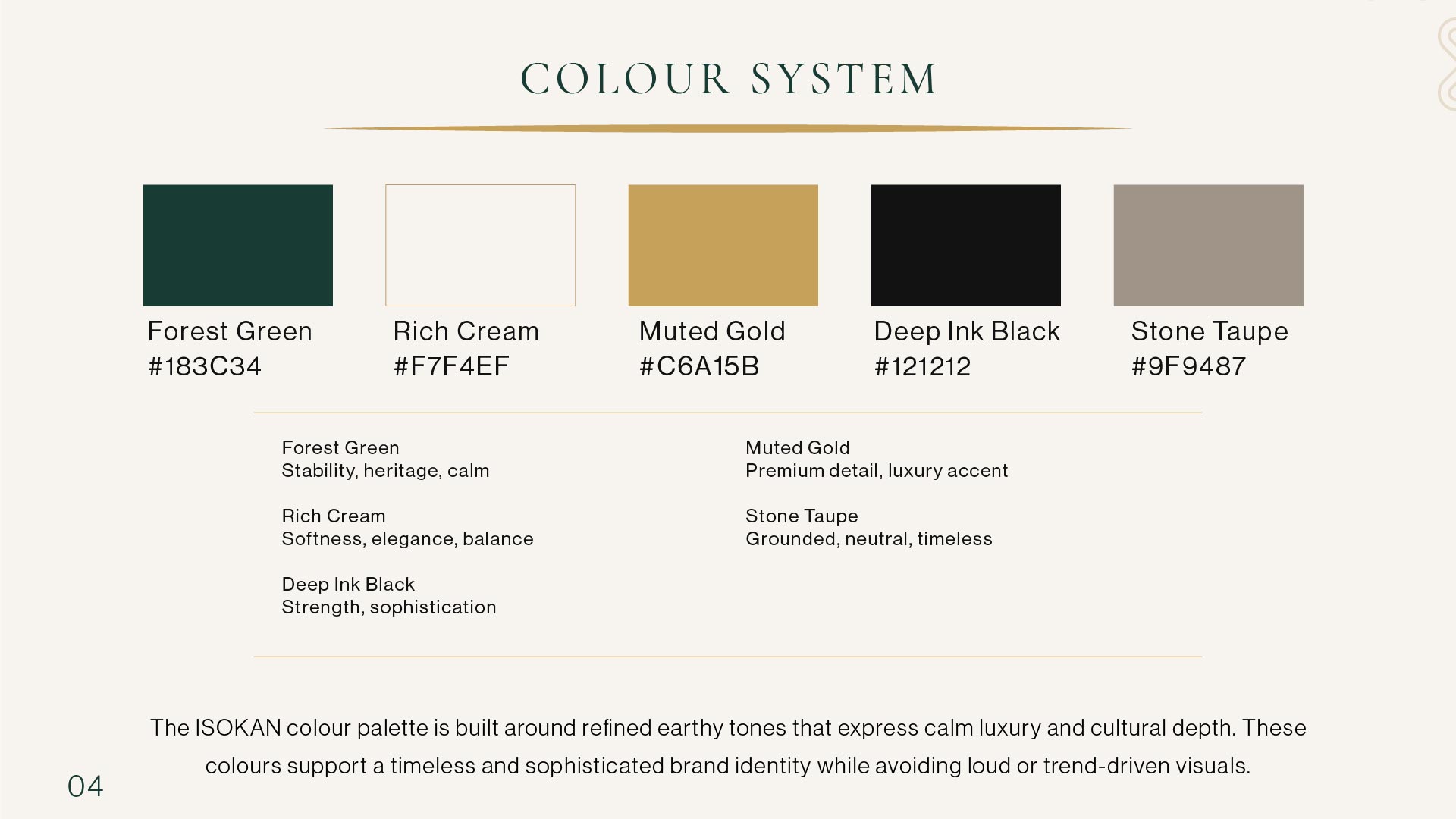
Typography and palette were built to feel clean, editorial, and controlled while still carrying warmth and cultural presence.
The applications are separated into individual touchpoints so the identity can be experienced the way a client or recruiter would see it in use.
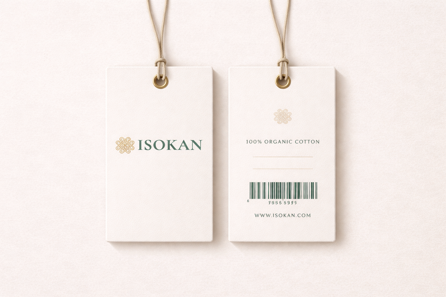
A tactile fashion application used to test how the identity behaves at a smaller, more physical scale.
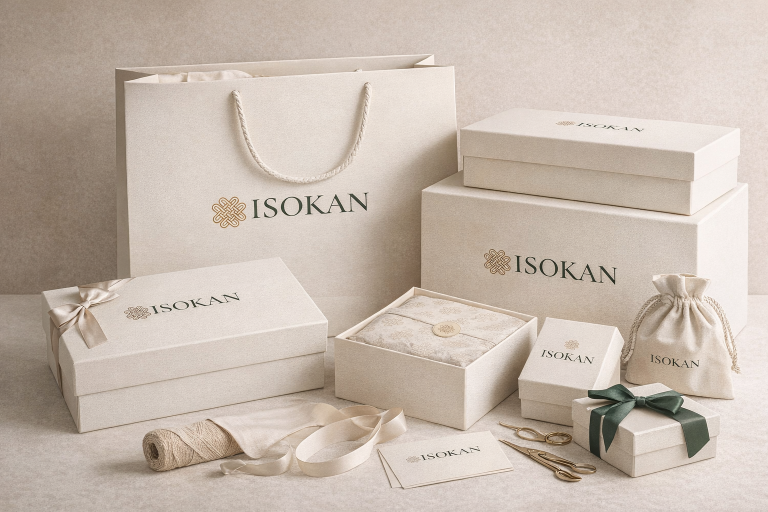
A larger retail application that pushes the system into a more premium consumer-facing space.
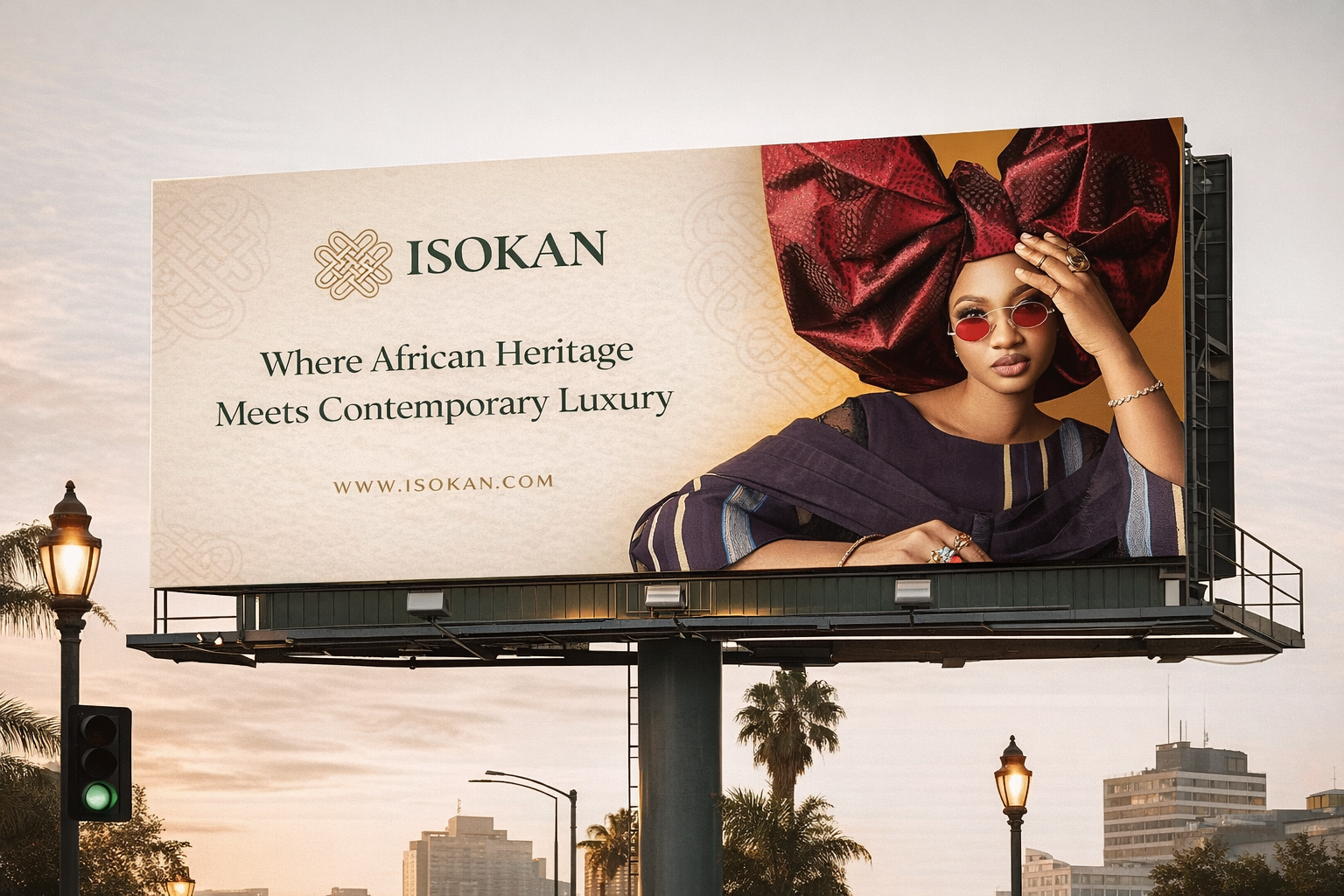
A scale test showing how the brand can command attention while staying calm, minimal, and recognizable.
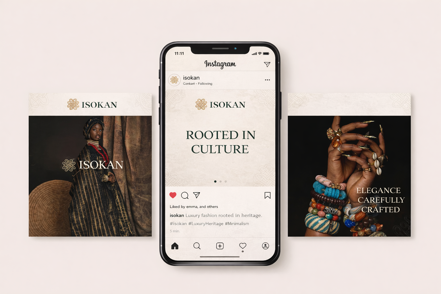
A digital extension of the brand used to test consistency, rhythm, and how the visual system performs across repeated content.
The ISOKAN website extends the identity into a digital retail space. The experience was designed as a sequence: introduce the brand, guide browsing, support product discovery, and add a styling feature that makes shopping feel more personal.
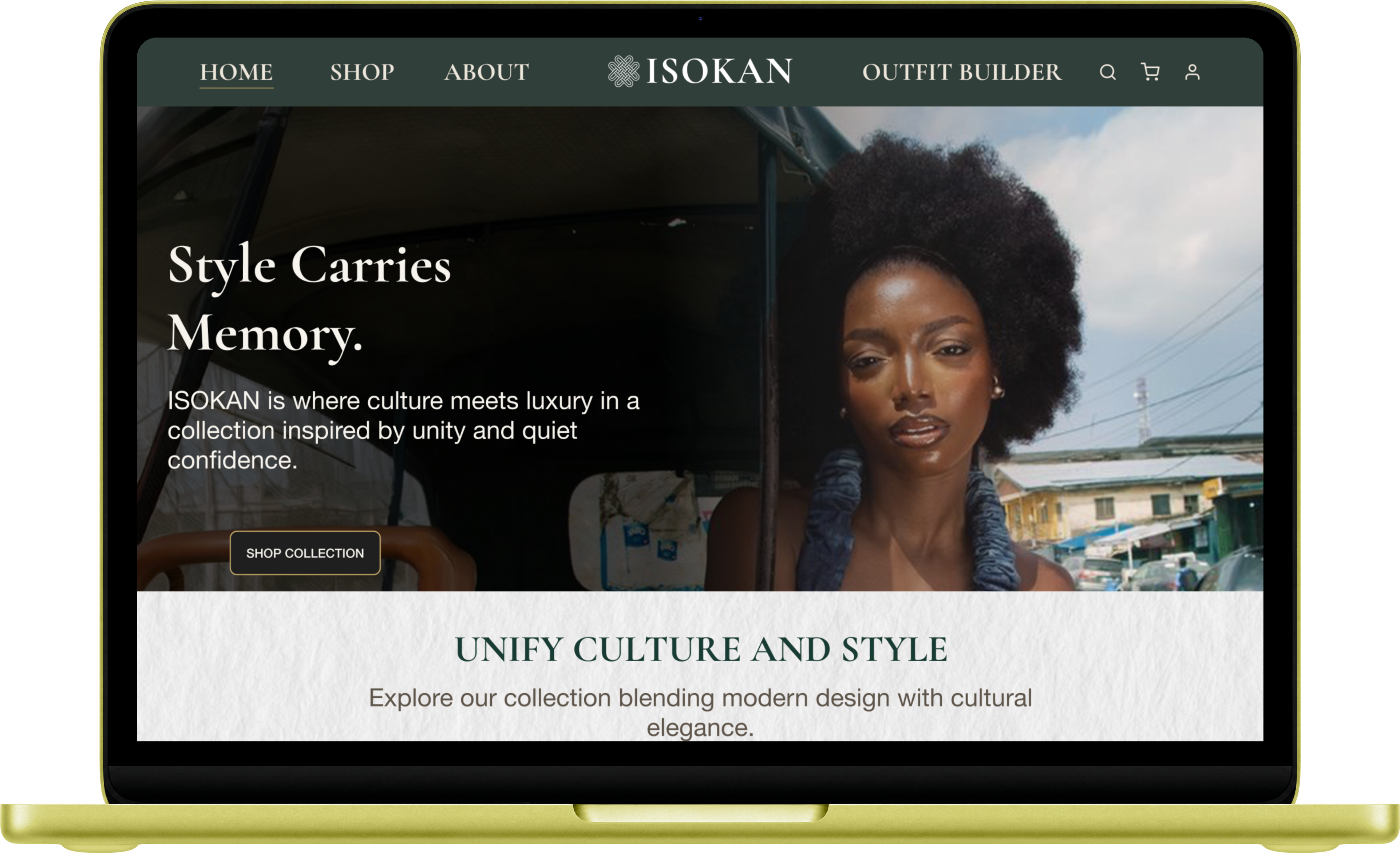
The homepage introduces ISOKAN through image-led storytelling, restrained typography, and a calm luxury tone that immediately sets the brand direction.
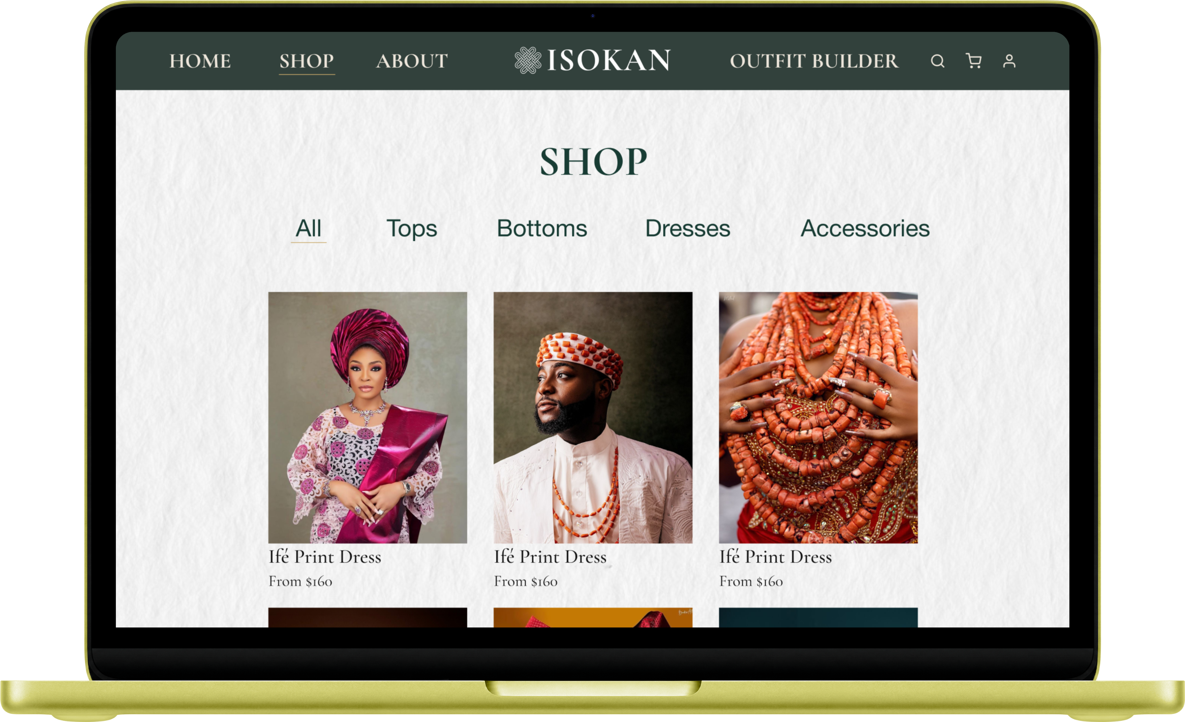
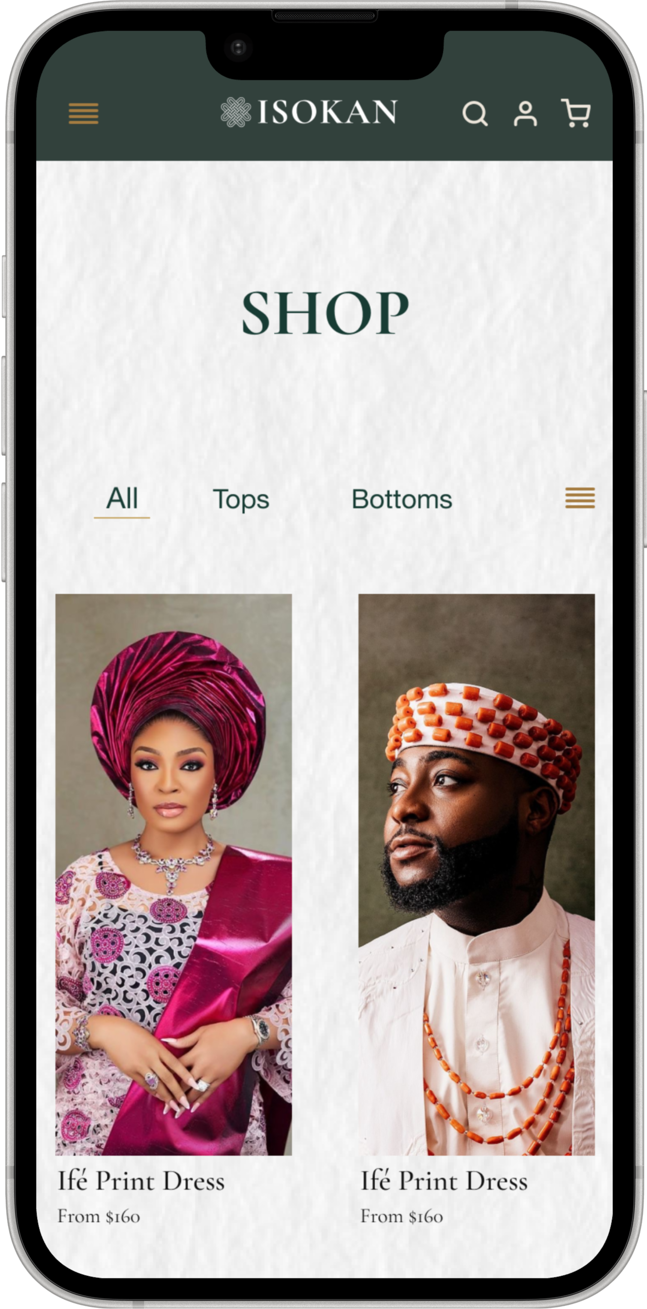
The shopping page presents the collection in a clean, editorial-inspired structure that keeps browsing simple while preserving the premium feel of the brand.
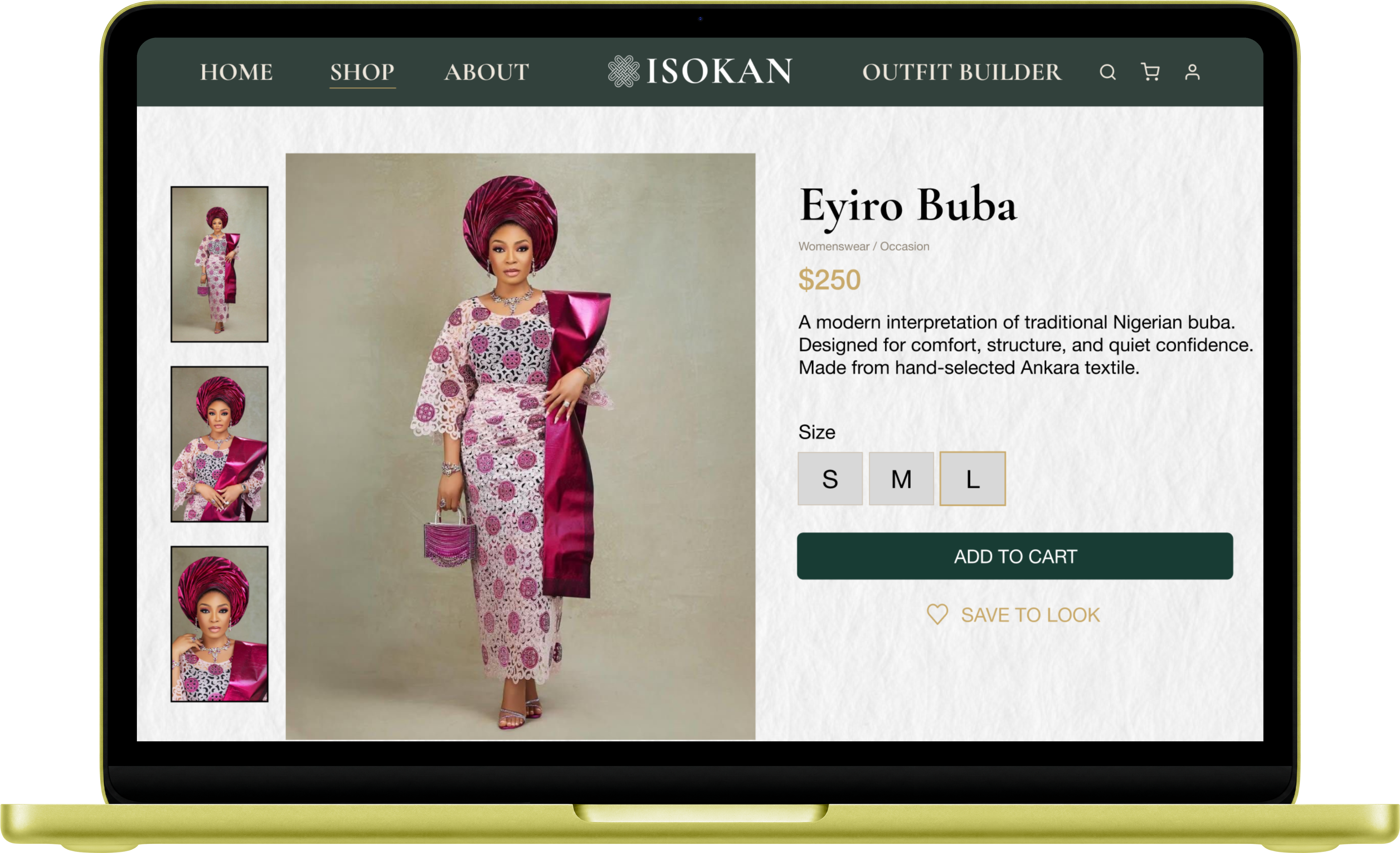
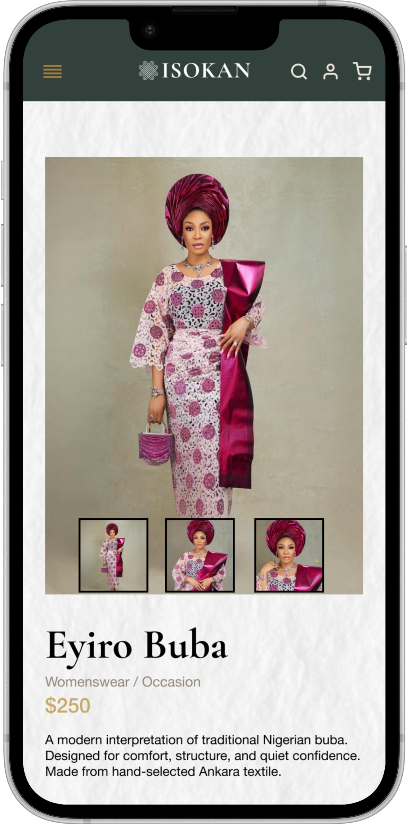
The product page balances imagery, garment detail, and purchase actions in a way that keeps the item itself as the main visual focus.
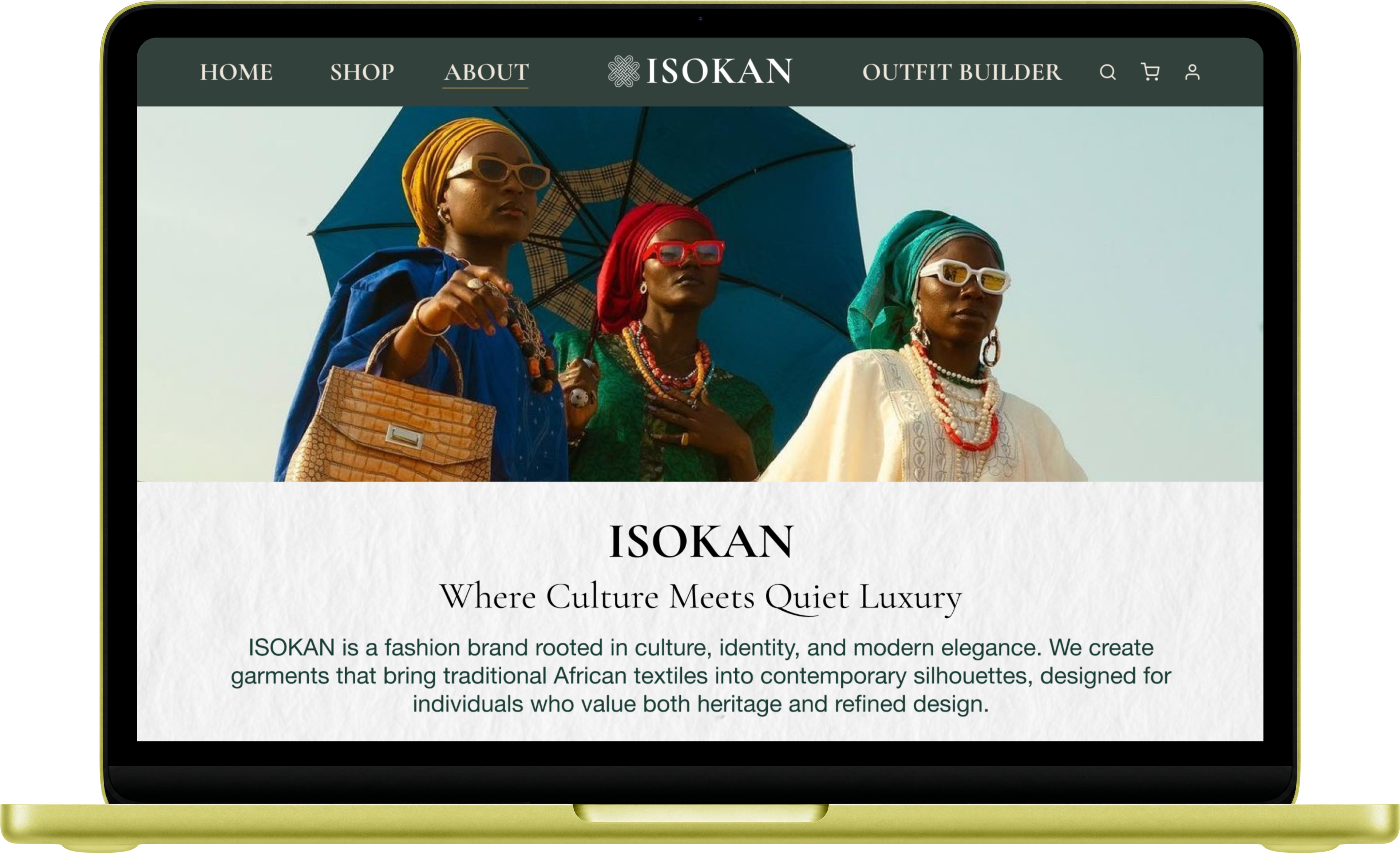
The about page expands the story behind ISOKAN, connecting the products back to culture, identity, and the quieter luxury tone of the brand.
The Outfit Builder adds a more interactive layer to the website by allowing users to mix and match garments and accessories to create a complete look before purchasing.
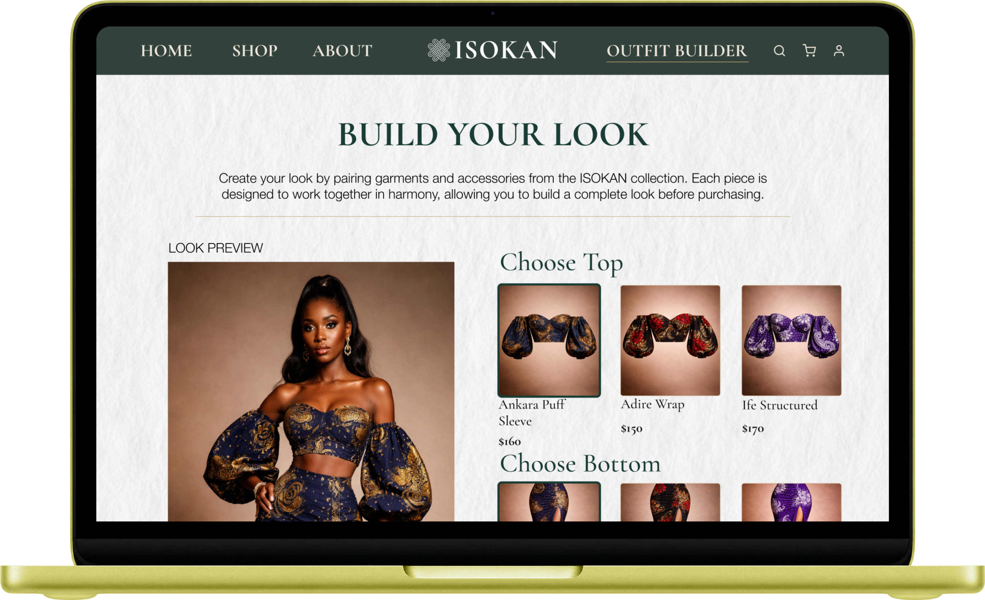
The Outfit Builder helps move the website beyond browsing by giving users a more personalized and styled shopping experience that fits the overall fashion direction of the brand.
The website was also adapted into a mobile layout by stacking content vertically, simplifying navigation, and keeping the same visual tone across smaller screens.
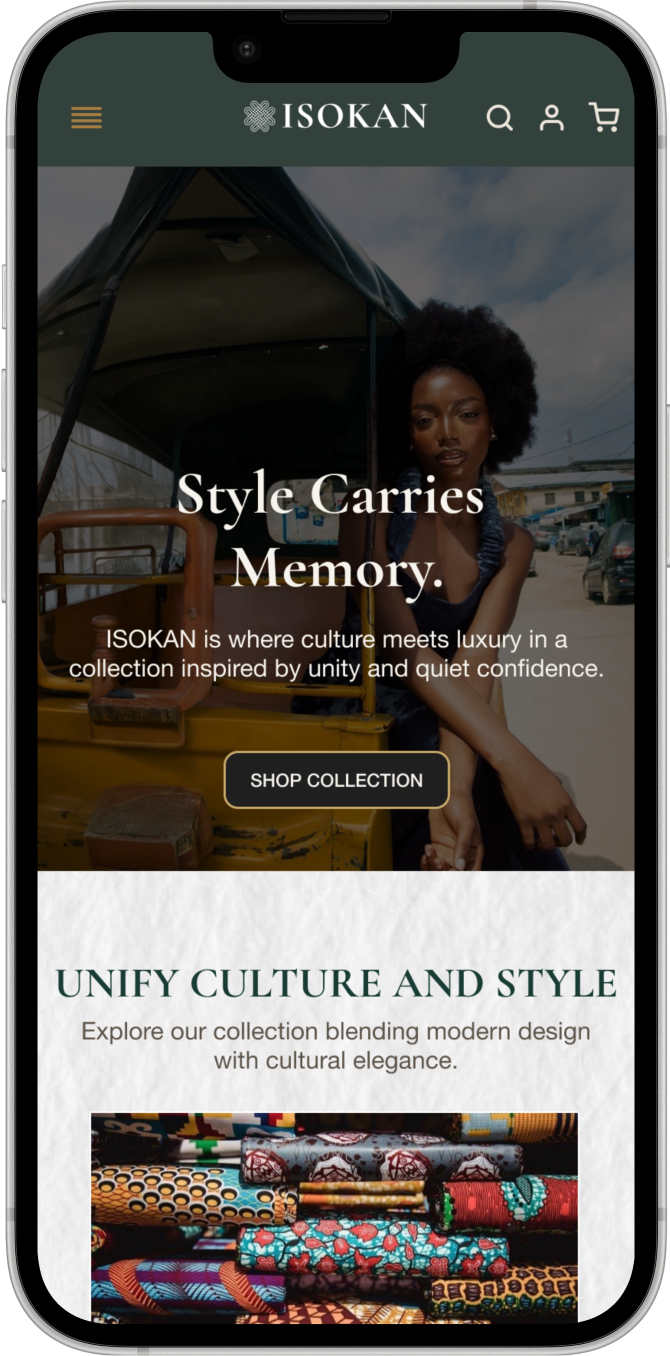
The homepage was adapted for mobile by simplifying the layout and stacking content vertically while keeping the same visual tone and storytelling structure.
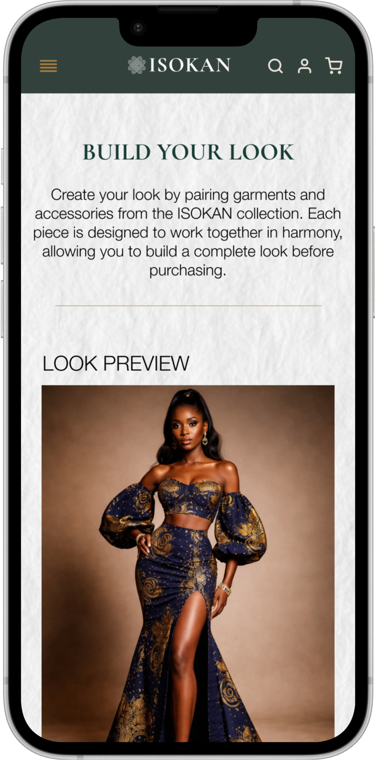
The styling feature was translated into a mobile-friendly format that still supports interaction, pairing, and guided look building on a smaller screen.
The product view keeps the garment central while still allowing room for image selection, sizing, description, and purchase actions.
The mobile shopping page keeps the editorial feel of the desktop version while making the browsing flow more direct and scroll-friendly.
The project was developed as a full brand world rather than a single mark. The process moved from meaning and visual direction into system-building and application testing.
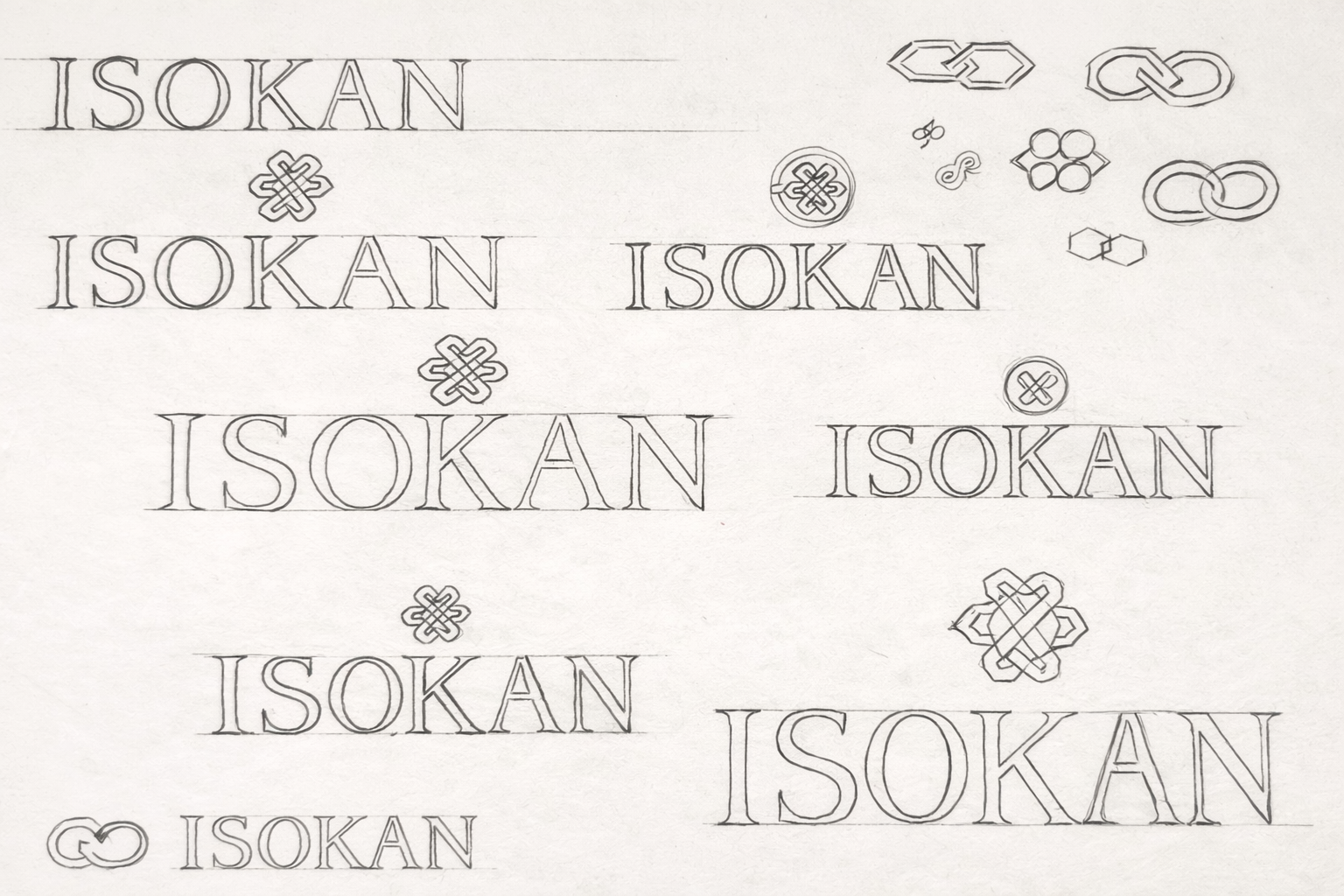
Early sketches and mark studies were used to define the balance between modern minimalism and cultural meaning.
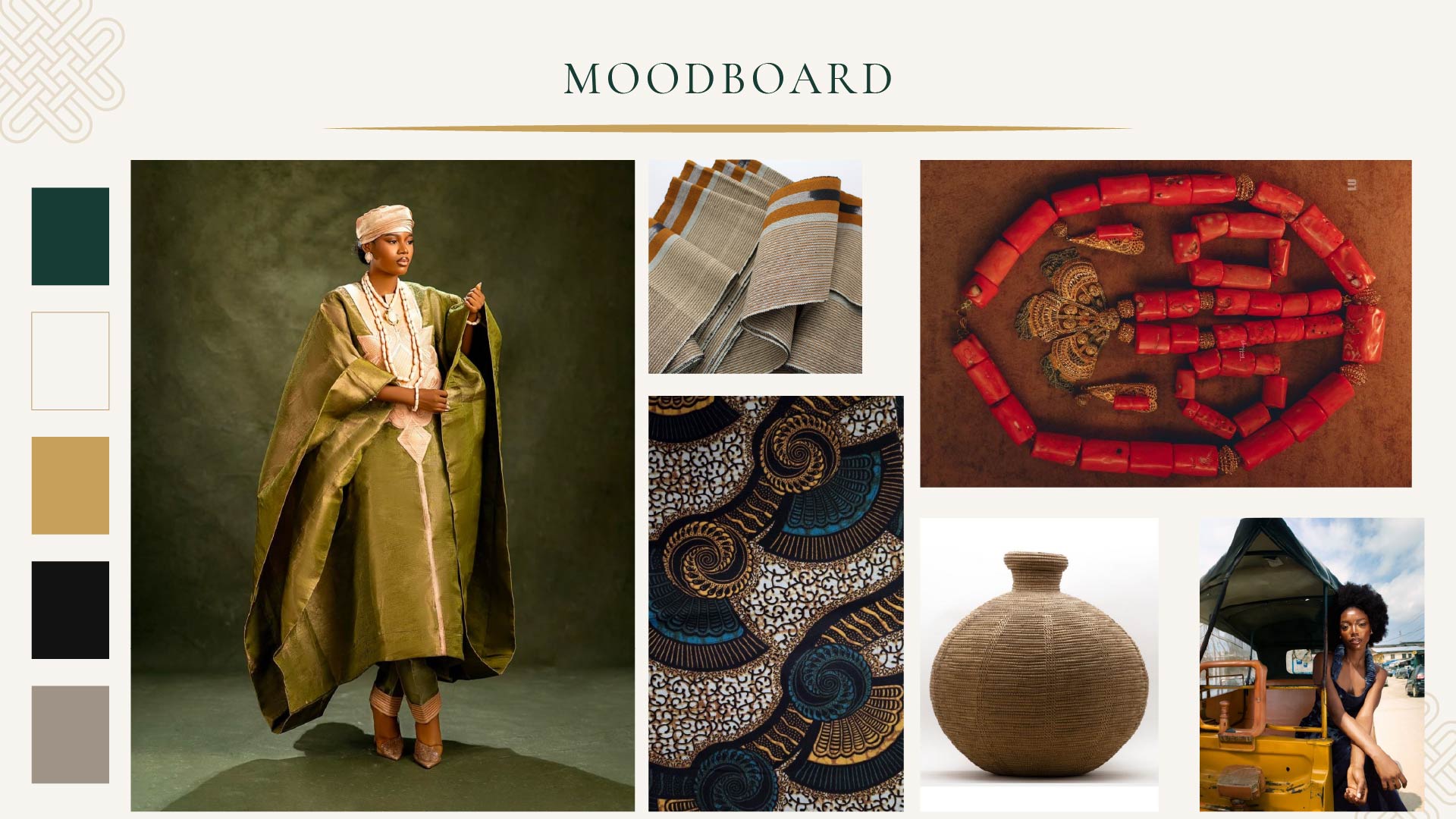
Moodboards, textures, fabric cues, and photography references helped define the brand’s visual atmosphere and emotional tone.
Logo rules, spacing, and usage guidelines were developed to ensure the identity stays consistent across different applications, materials, and layouts.
The editorial component extends the ISOKAN identity into a more narrative space, using layout, typography, photography, and pacing to build a stronger brand voice.
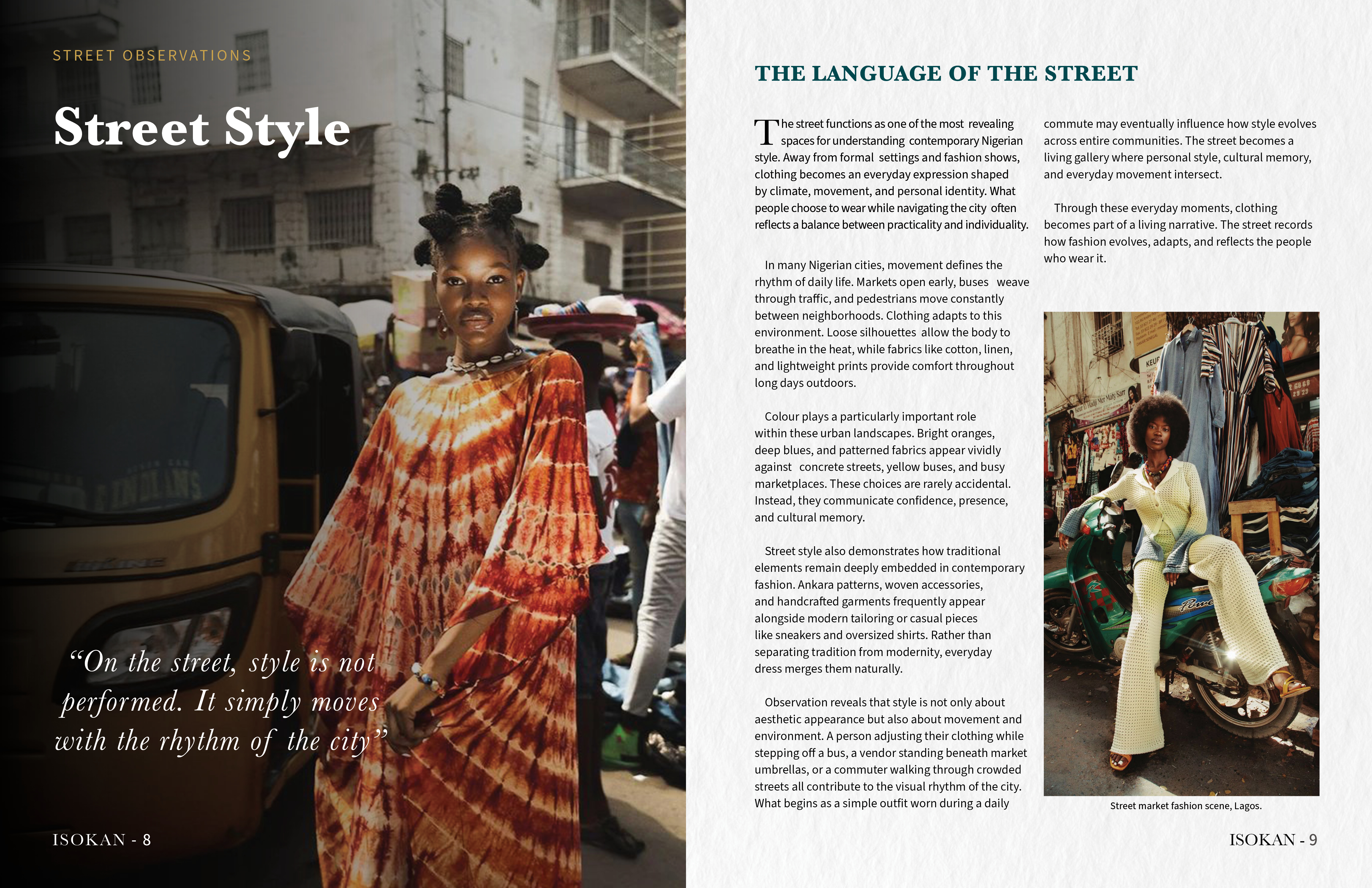
This spread explores editorial hierarchy through a combination of full-bleed imagery, pull quotes, and column-based text layout. It demonstrates how the ISOKAN visual language translates into magazine-style composition and pacing.
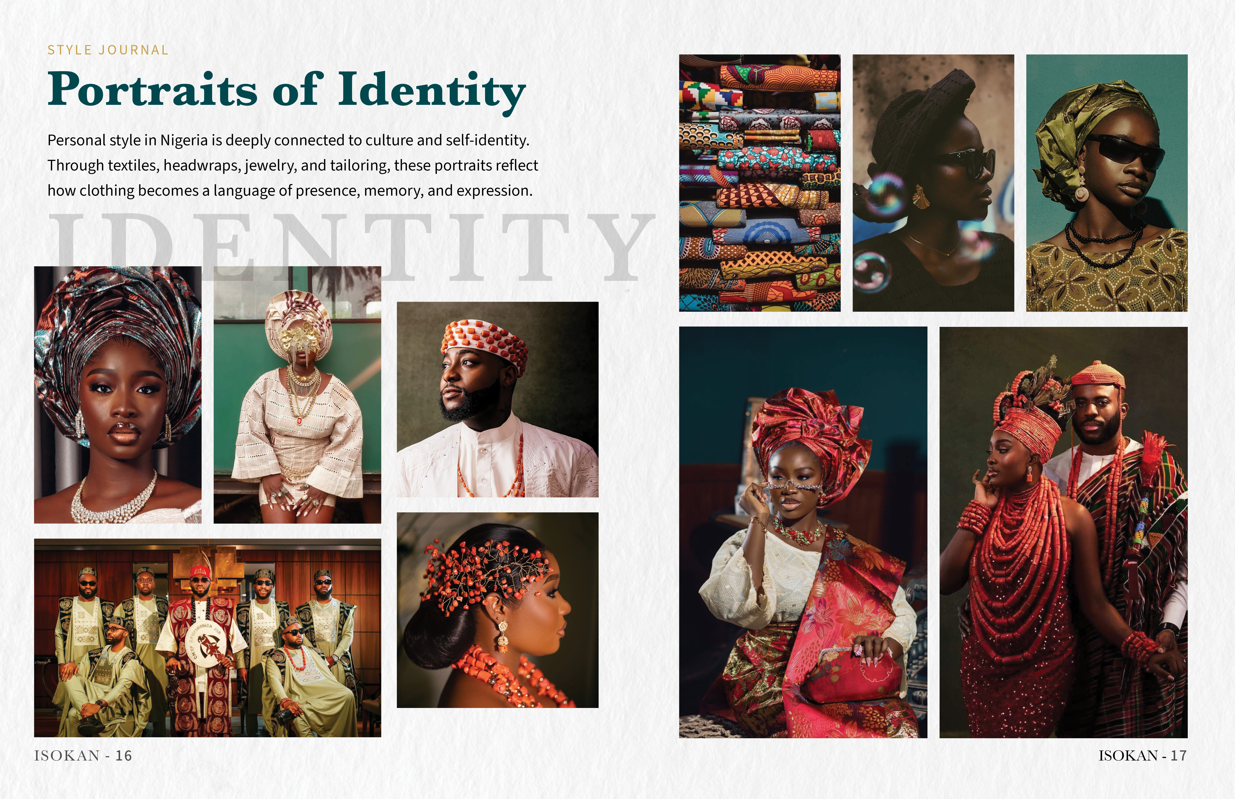
This spread focuses on image rhythm and visual storytelling through a structured grid system. It highlights how photography, spacing, and composition work together to communicate identity, culture, and mood within the ISOKAN brand world.
Beyond the spreads themselves, the zine functions as a printed brand object — a tactile extension of the identity that brings the editorial system into a more complete physical format.
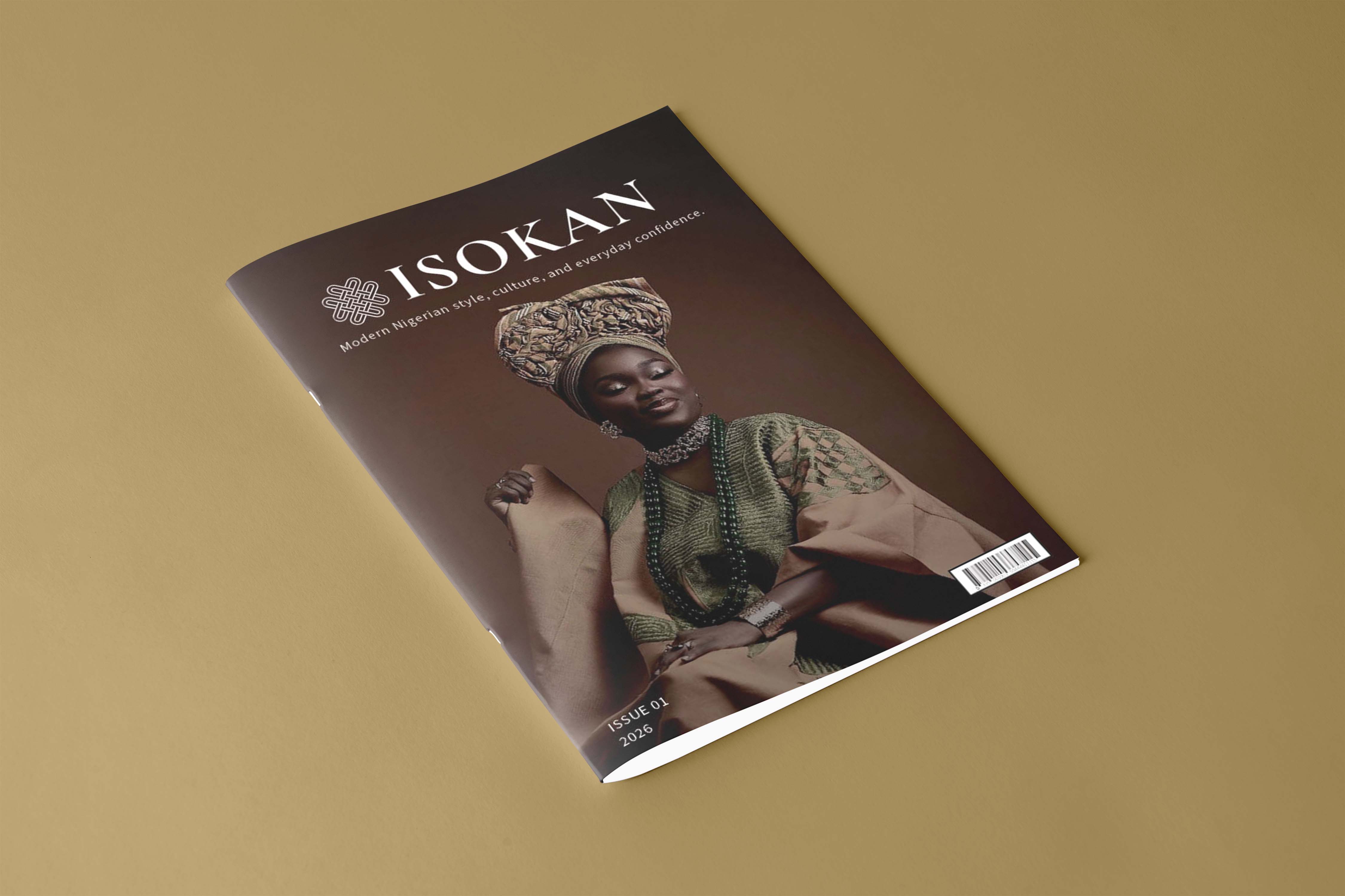
The cover acts as the first point of entry into the editorial side of the brand and reinforces the overall visual tone.
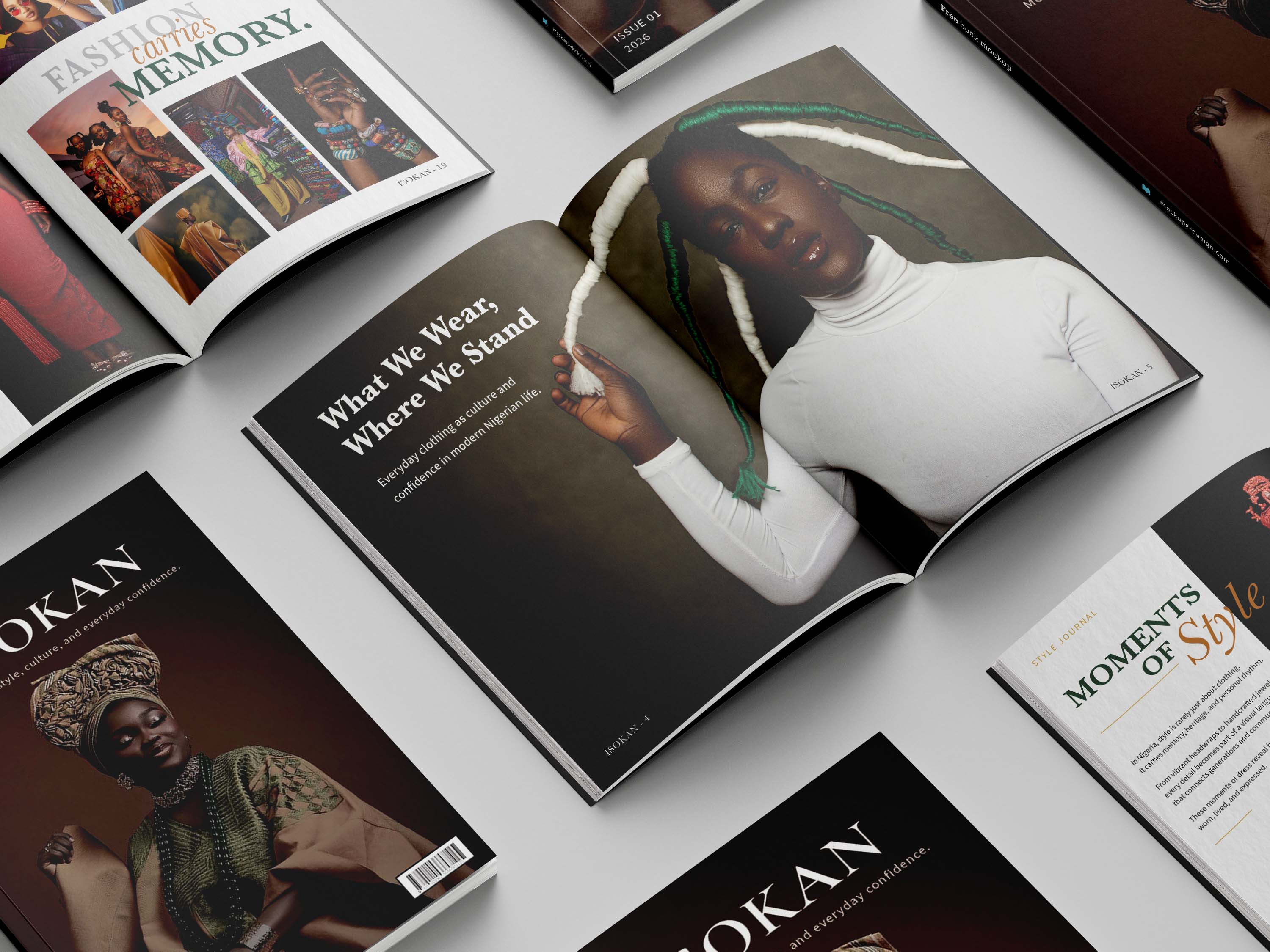
View the complete zine to see how the brand develops across multiple pages through layout, storytelling, and image rhythm.
Open full zine →ISOKAN brings together branding, fashion applications, editorial design, digital experience, and art direction into one connected visual identity. It shows how I think through concept, structure, and storytelling at the same time.
A final overview bringing together identity, applications, editorial direction, website design, and overall visual tone in one connected system.