Project type
Luxury fashion identity concept
Brand Identity • Visual System
A luxury eco-fashion identity built to feel calm, elevated, and modern across packaging, tags, and branded touchpoints.
The final system uses restrained typography, controlled spacing, and premium applications to position EcoThreads as a calm, elevated fashion brand.
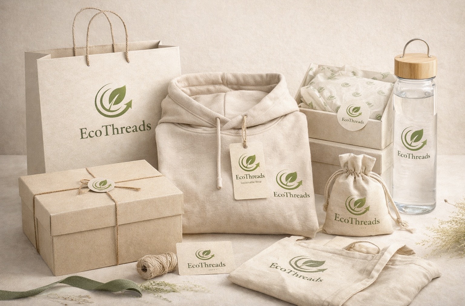
A grouped application image that brings the identity together across multiple touchpoints and makes the brand feel more complete and client-facing.
Primary and supporting marks were refined to stay flexible across tags, packaging, and editorial-style layouts.
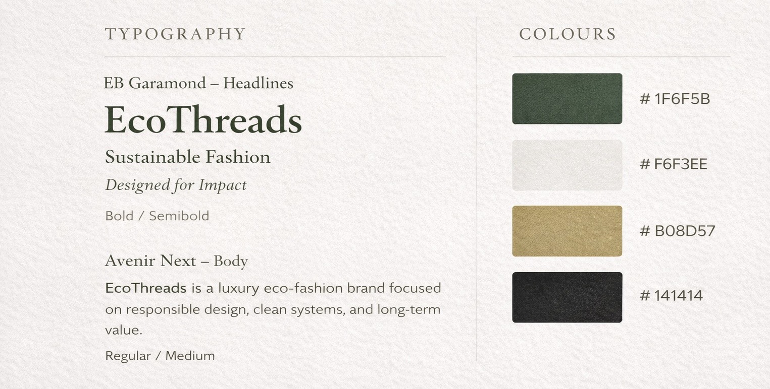
The palette and typographic rules were designed to keep the brand restrained, legible, and consistent across all applications.
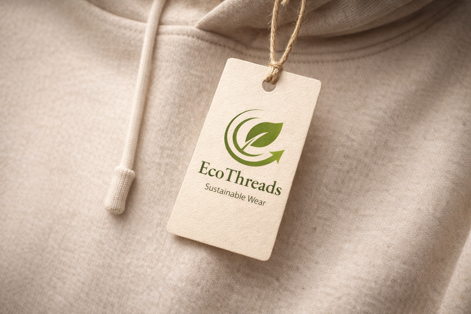
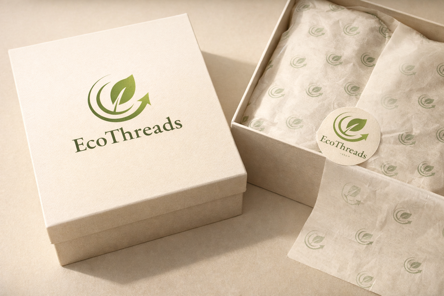
The identity was tested on small-format touchpoints to confirm hierarchy, spacing, and tone at a realistic scale.
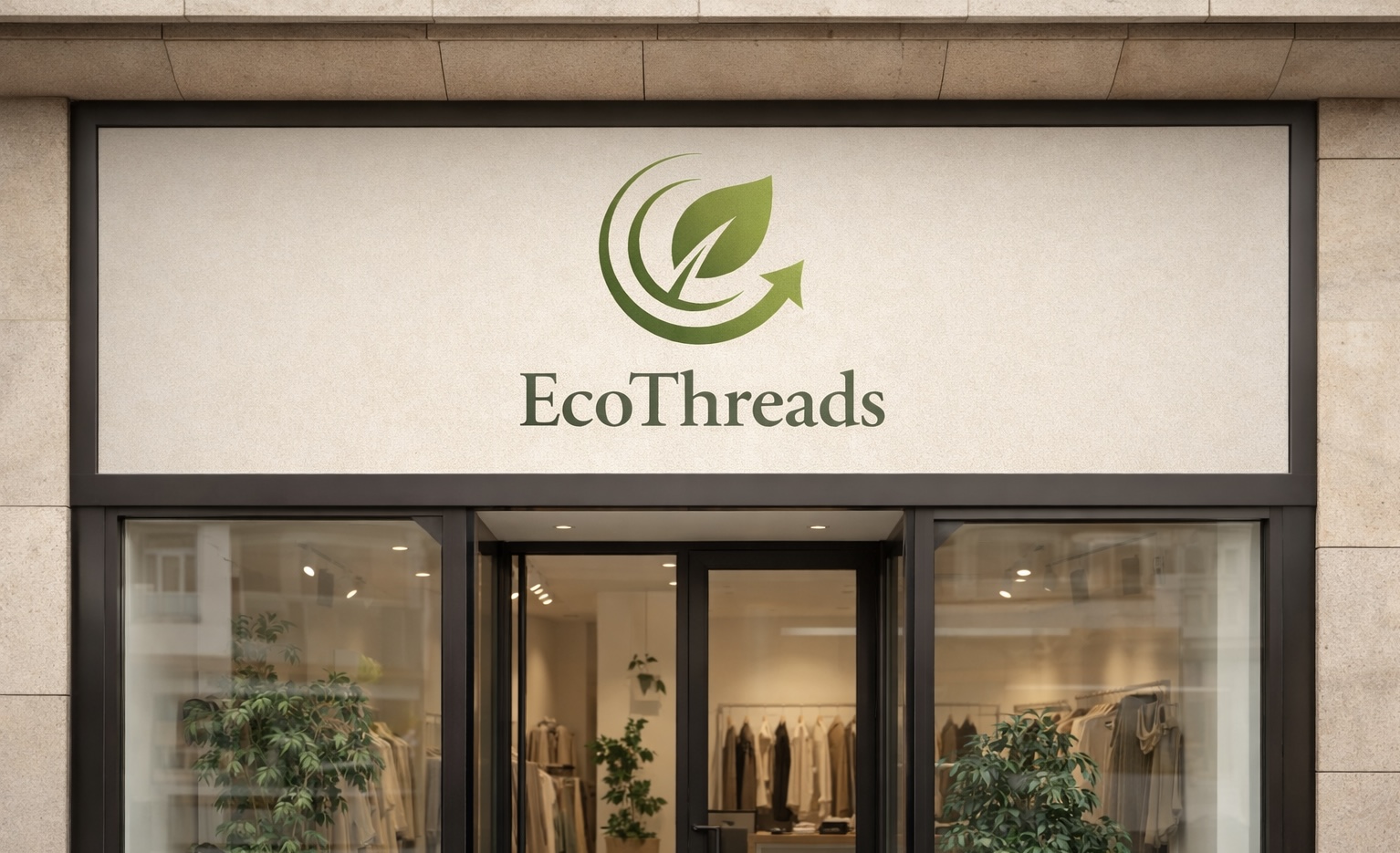
The storefront concept extends the identity into a larger environment and helps the project feel more complete and commercially believable.
Sustainability branding often leans too literal or too earthy, which can make a fashion brand feel generic instead of premium. EcoThreads needed to communicate eco-conscious values while still looking refined, modern, and commercially viable.
The final system presents EcoThreads as a believable luxury brand with scalable assets that can move across packaging, tags, signage, and branded environments without losing its tone.
The process focused on refining a usable identity system rather than treating each mockup as a separate one-off design. The goal was to make every application feel like it came from the same brand logic.
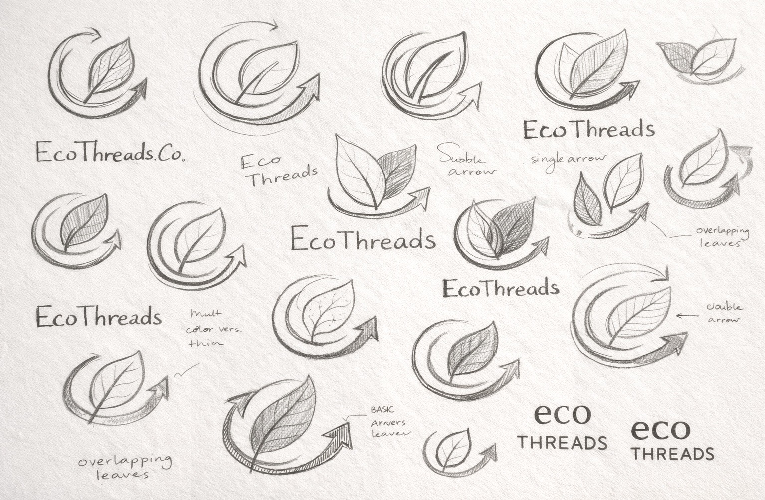
I explored leaf, thread, and woven-inspired forms, then reduced the system down to marks that felt cleaner, sharper, and more commercially usable.
Typography, colour, and spacing were defined early so every touchpoint would feel like part of one brand world instead of disconnected mockups.
Mockups were used to test whether the identity held up across realistic fashion touchpoints such as packaging, tags, and retail environments, and to make sure the brand stayed consistent at different scales.
EcoThreads shows my ability to build a brand system that is not only visually polished, but also strategically restrained and consistent across multiple client-facing applications. It communicates brand thinking, typography control, and how I move from concept to scalable execution.