Project focus
Shelf impact, flavor distinction, production thinking
Packaging • Print • Brand System
Hydraforce PRO is a sports-focused beverage packaging concept built around bold flavor coding, strong hierarchy, and a scalable retail system that works across bottles, labels, and structural packaging.
Hydraforce PRO was designed as a high-energy beverage concept with a strong focus on packaging clarity. The project needed to feel fast, bold, and retail-ready while still keeping the label information organized and easy to read.
The final system balances energy and structure, giving Hydraforce a bold shelf presence while keeping the packaging clear, scalable, and believable as a consumer product.
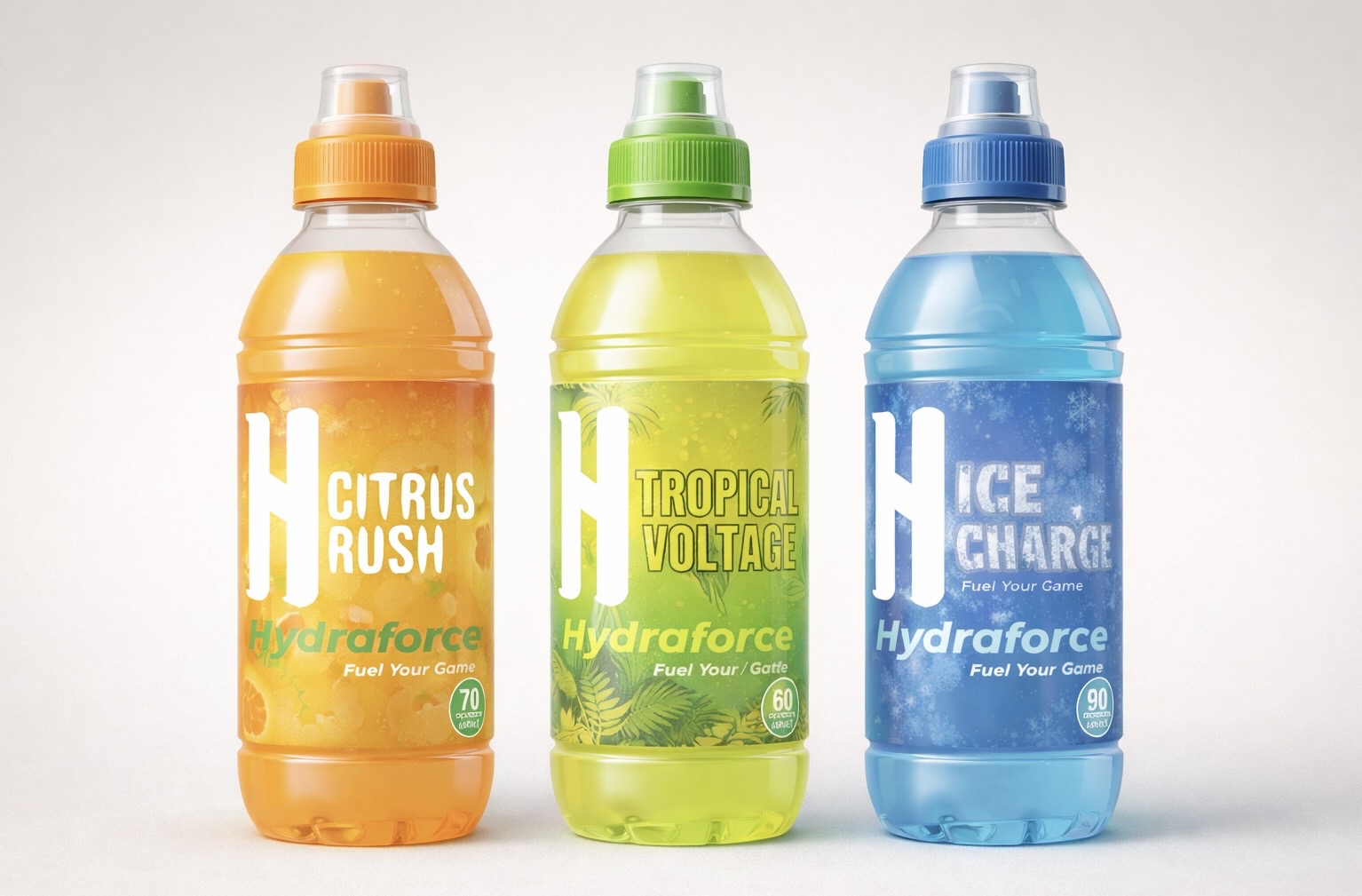
The final lineup introduces Hydraforce as a consistent product family, using flavor-specific palettes and textures while keeping the overall label hierarchy clearly unified.
The lineup shows how the label system works across multiple flavors while still reading as one cohesive beverage brand.
Each flavor was designed individually so the differences are easy to see, while the typography, logo placement, and information structure stay consistent across the set.
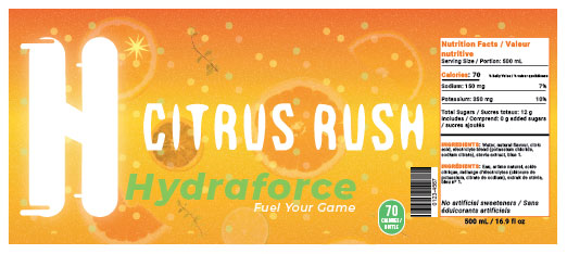
Warm orange tones, circular energy textures, and high-contrast type were used to communicate brightness, movement, and quick performance energy.
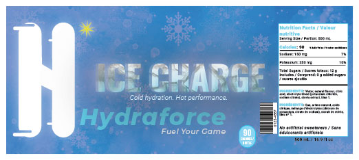
Cooler blue tones and frost-inspired graphics create a sharper, more refreshing flavor identity while keeping the same Hydraforce label structure.
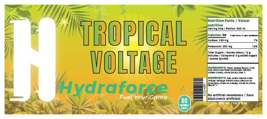
A brighter yellow-green palette and layered tropical textures were used to make the flavor feel bold, energetic, and instantly recognizable on shelf.
Beyond the bottle labels, the project expanded into structural packaging. The single-pack box was designed to hold one shot product while carrying the same bold visual language into a more retail-focused format.
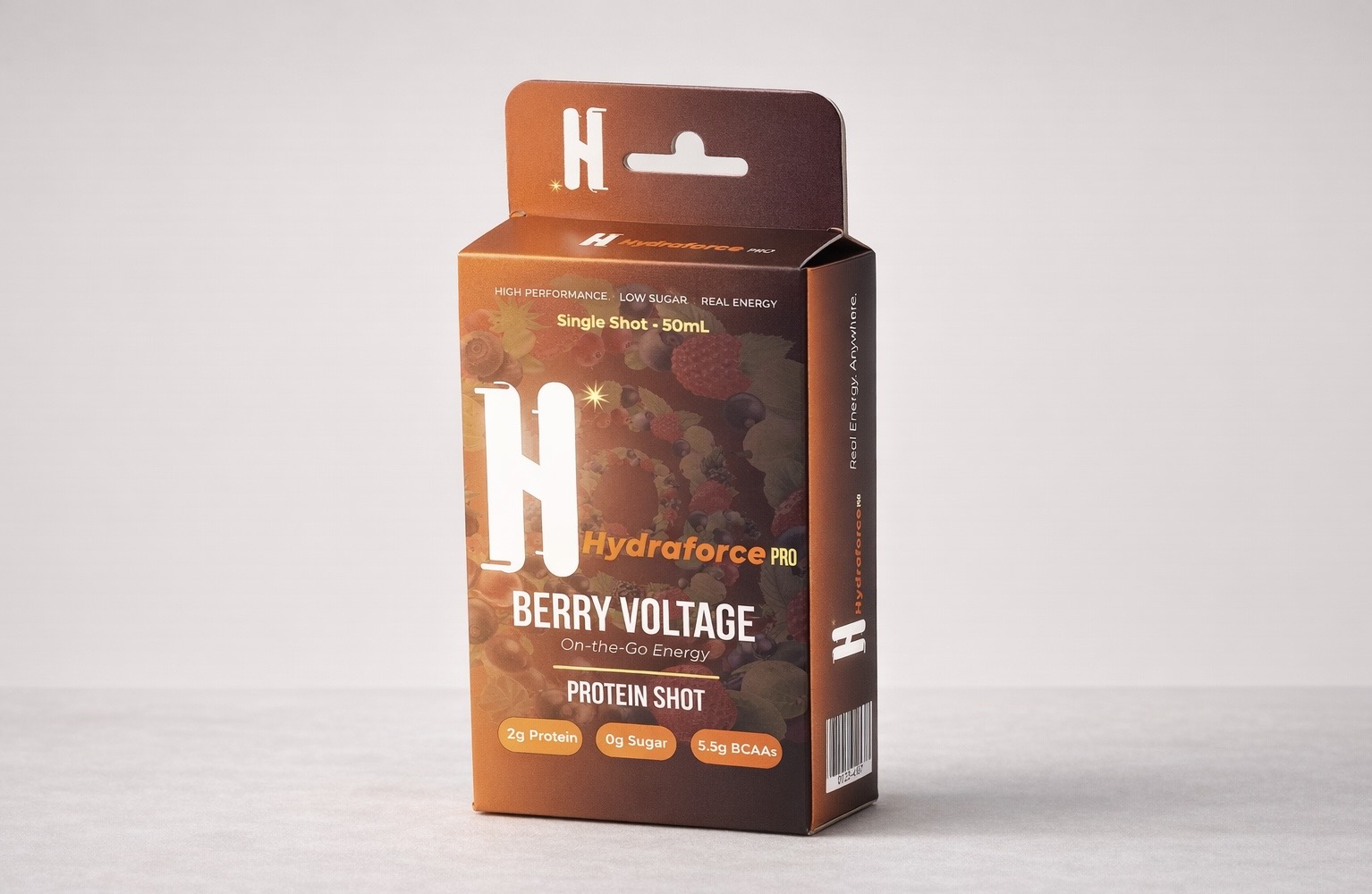
The single-pack format tests how the brand extends beyond the bottle, using the same strong front-facing hierarchy and flavor-led color treatment.
Structural thinking was an important part of the project. The packaging was designed with clear cut and fold logic so the final box could work as a real printed object rather than just a flat graphic surface.
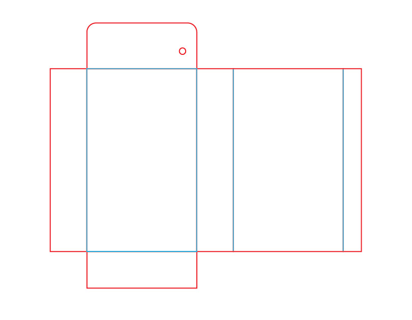
The base dieline was constructed with cut and fold lines to create a compact single-pack structure that could hold the product securely and assemble cleanly.
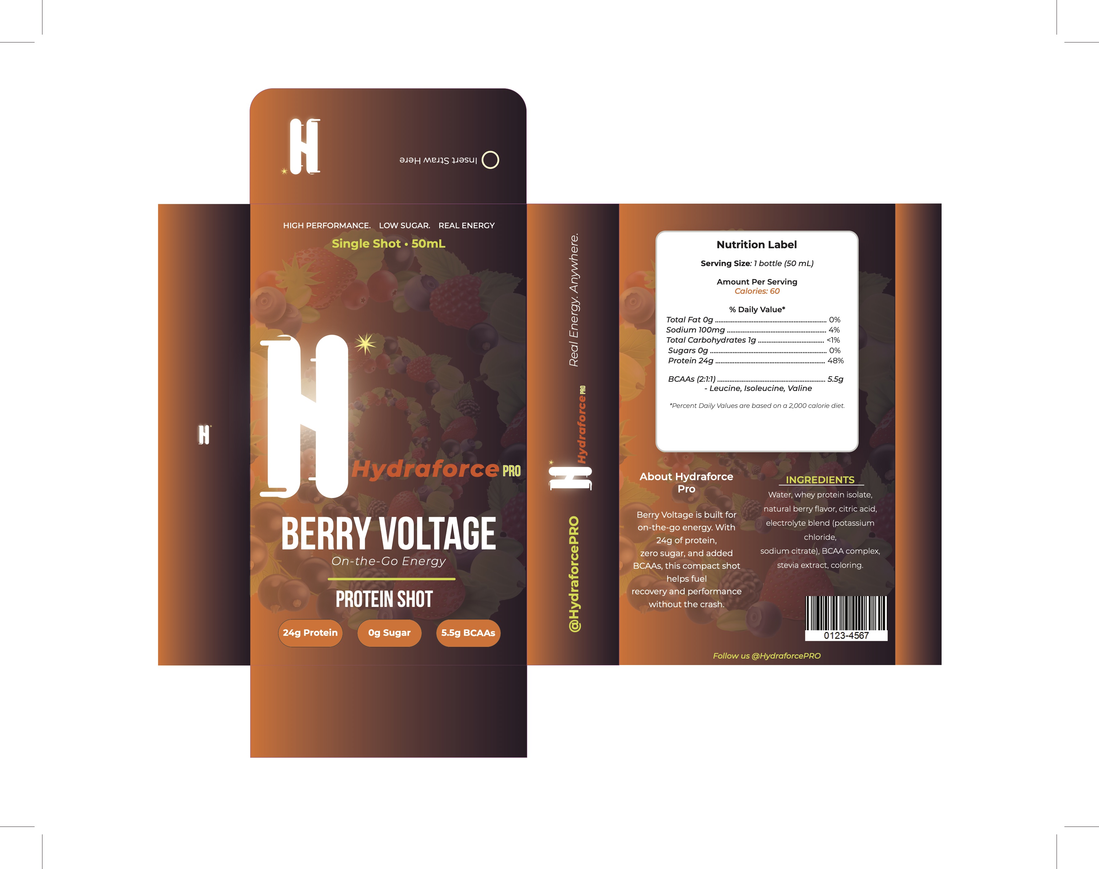
The packaging graphics were then applied across the unfolded layout to test alignment, panel continuity, and how the visual system wraps around the form.
The final mockup shows how the dieline translates into a believable 3D package, connecting flat production design with a more realistic retail presentation.