Creative Archive
Selected Explorations
A curated collection of posters, event graphics, typography studies, and visual experiments exploring communication, layout, and branding across different formats.
Smaller works, fast-turnaround graphics, and experimental studies that show how I think beyond full case studies.
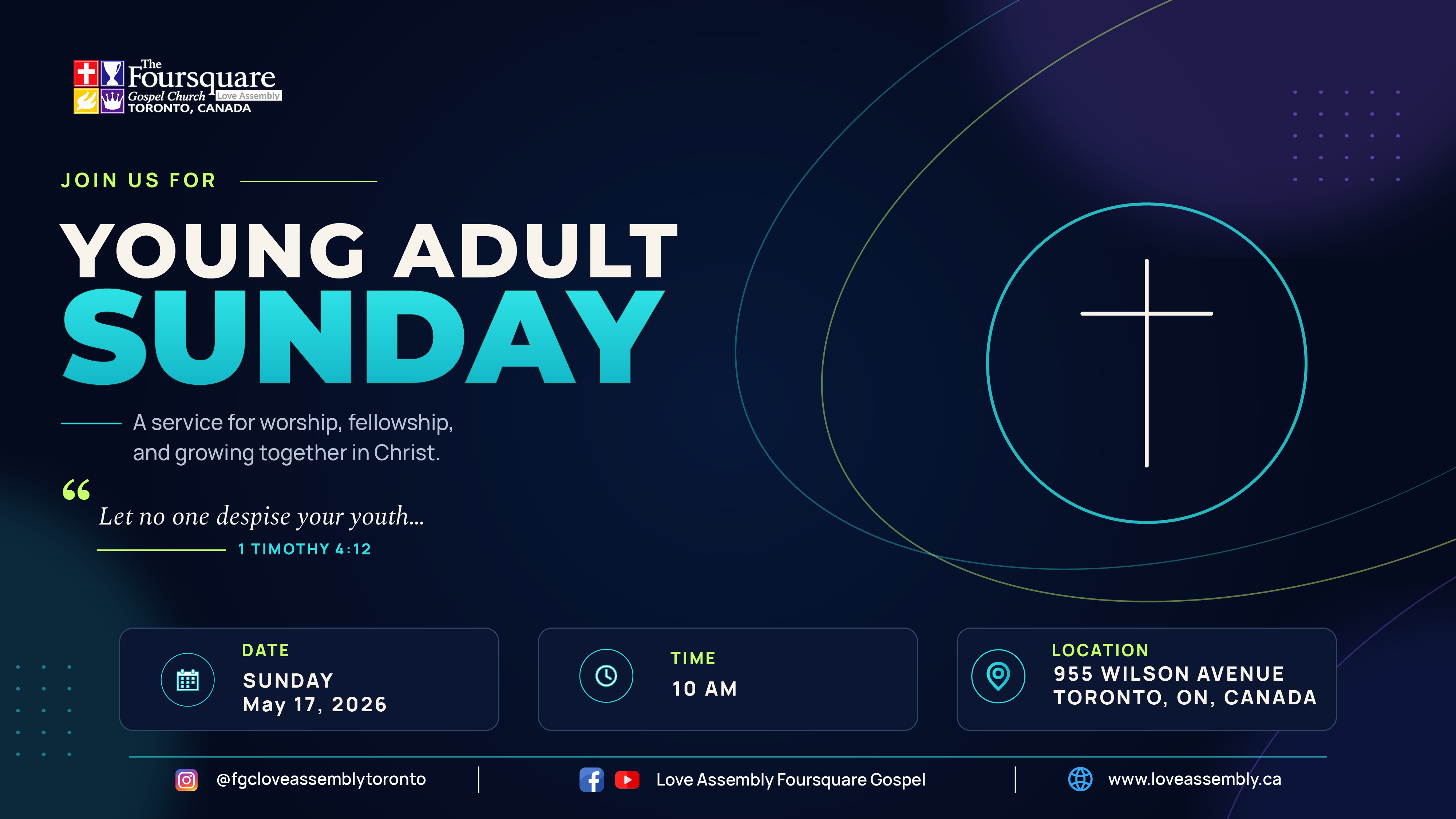
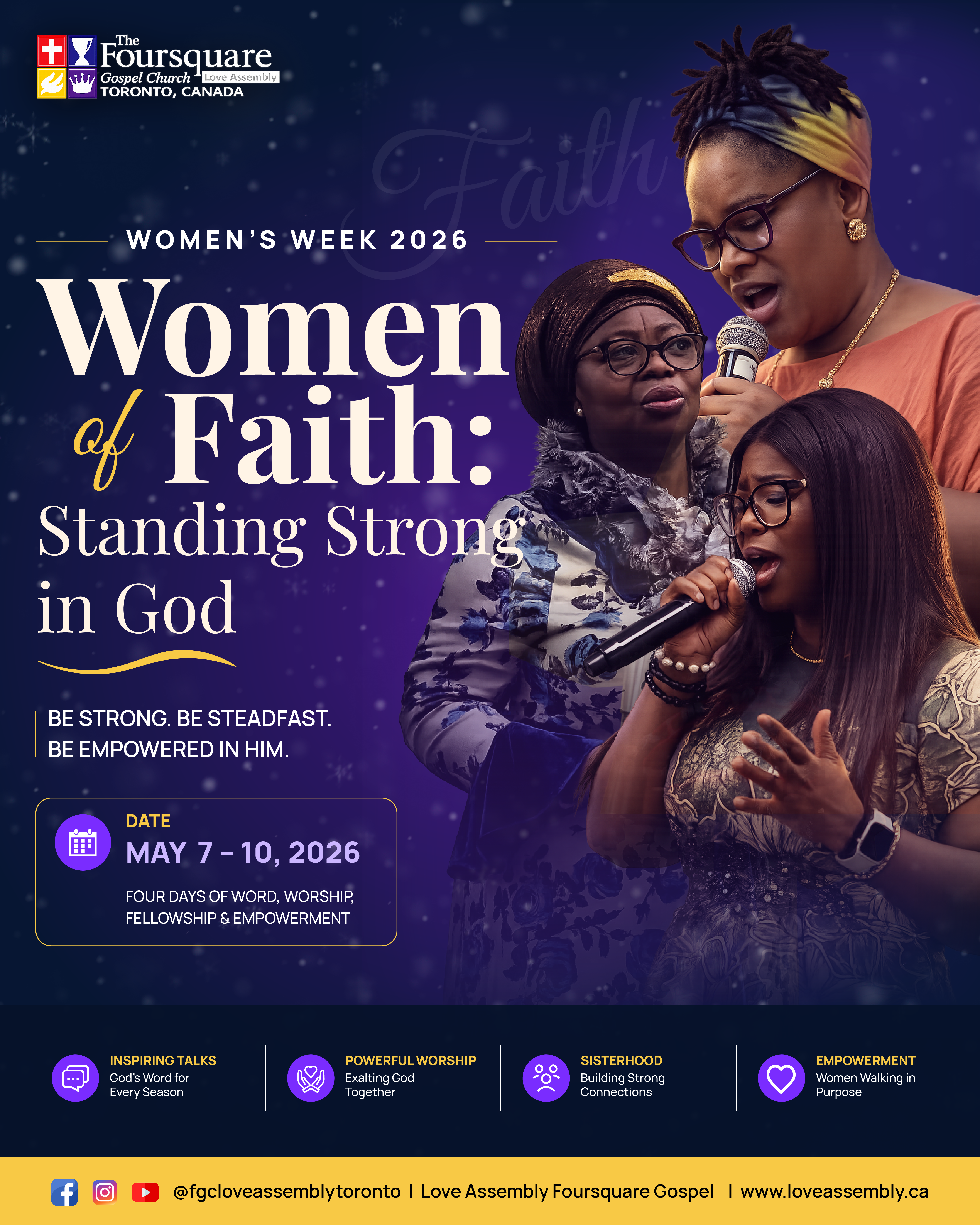
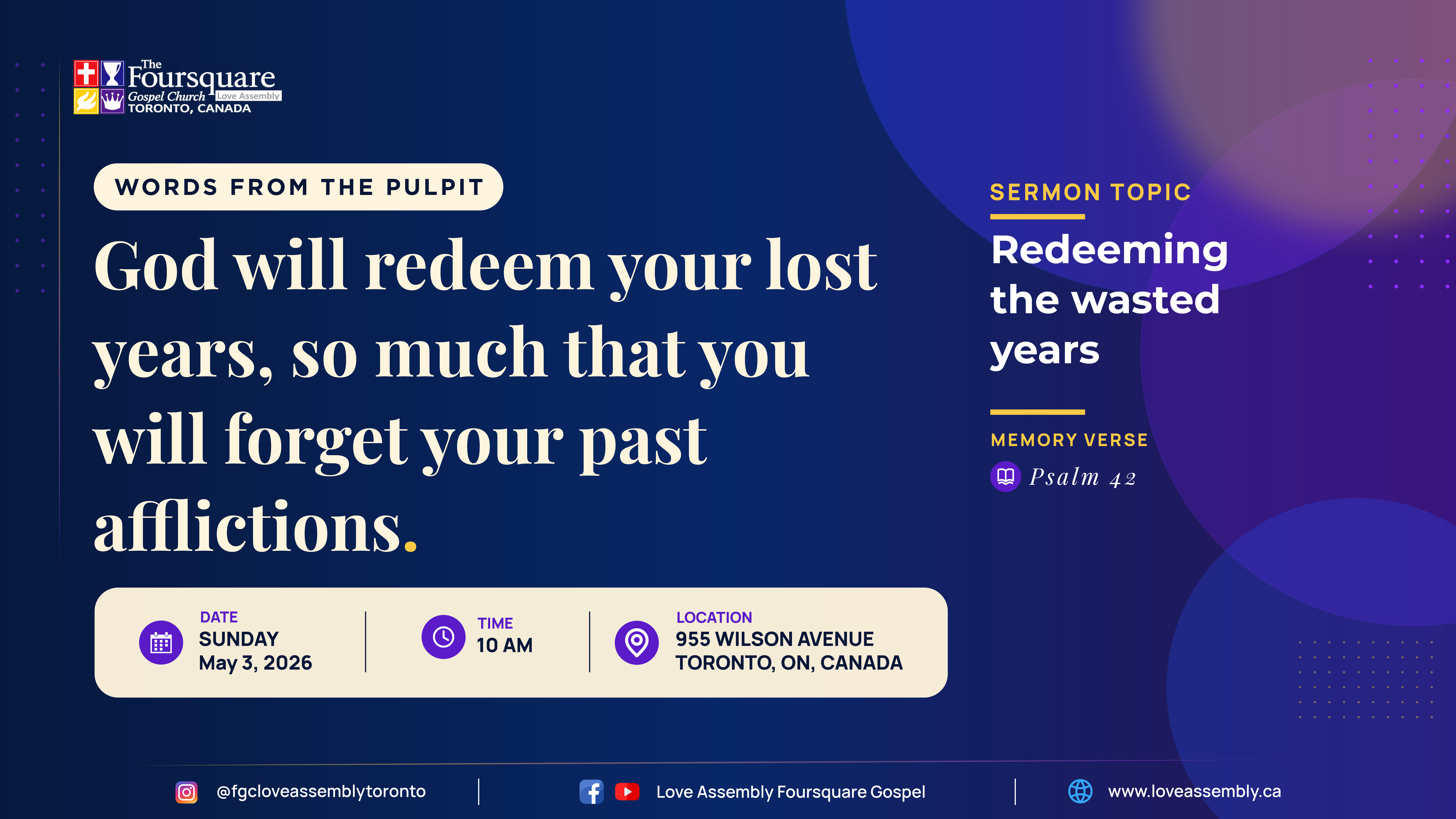
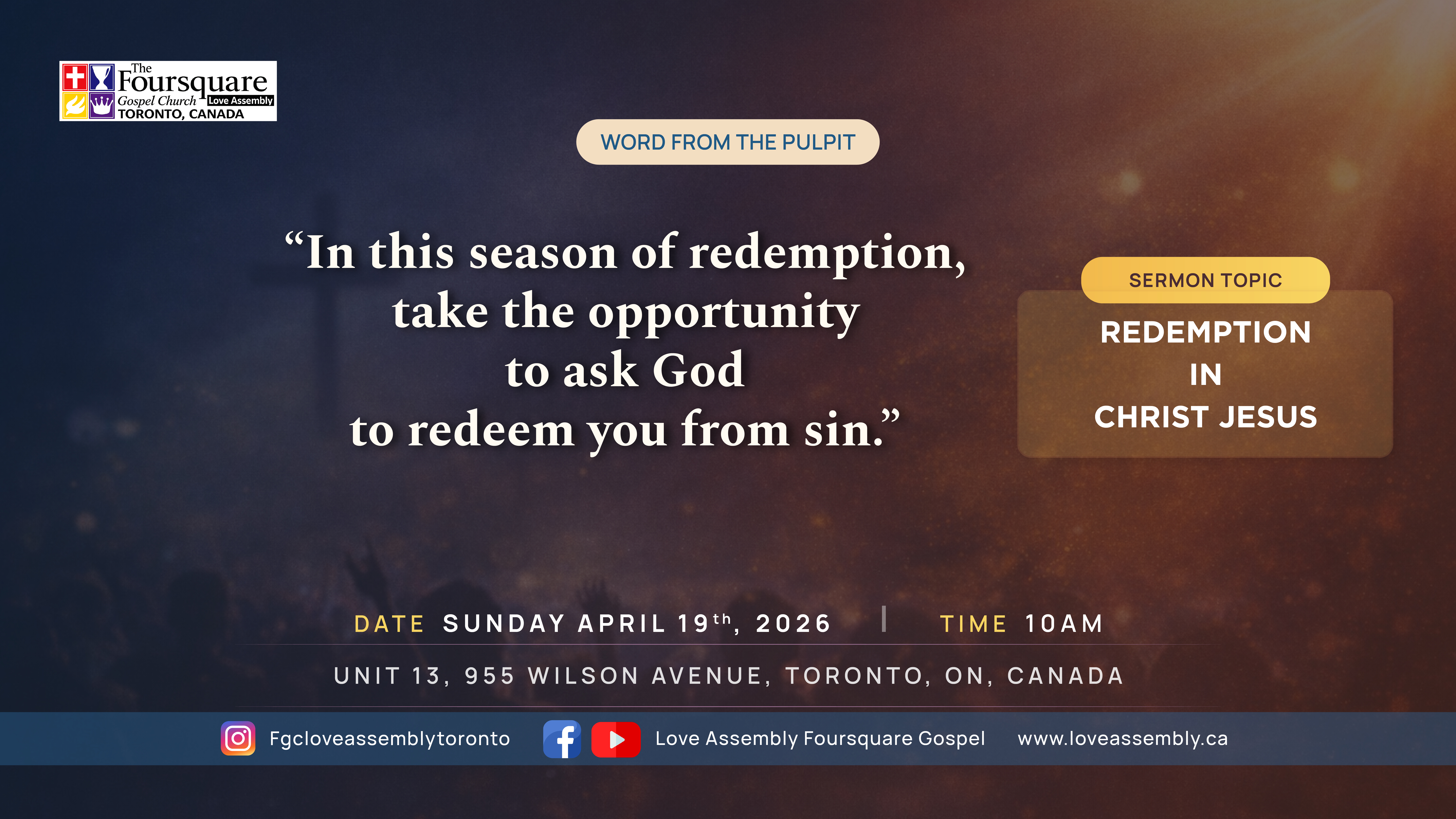
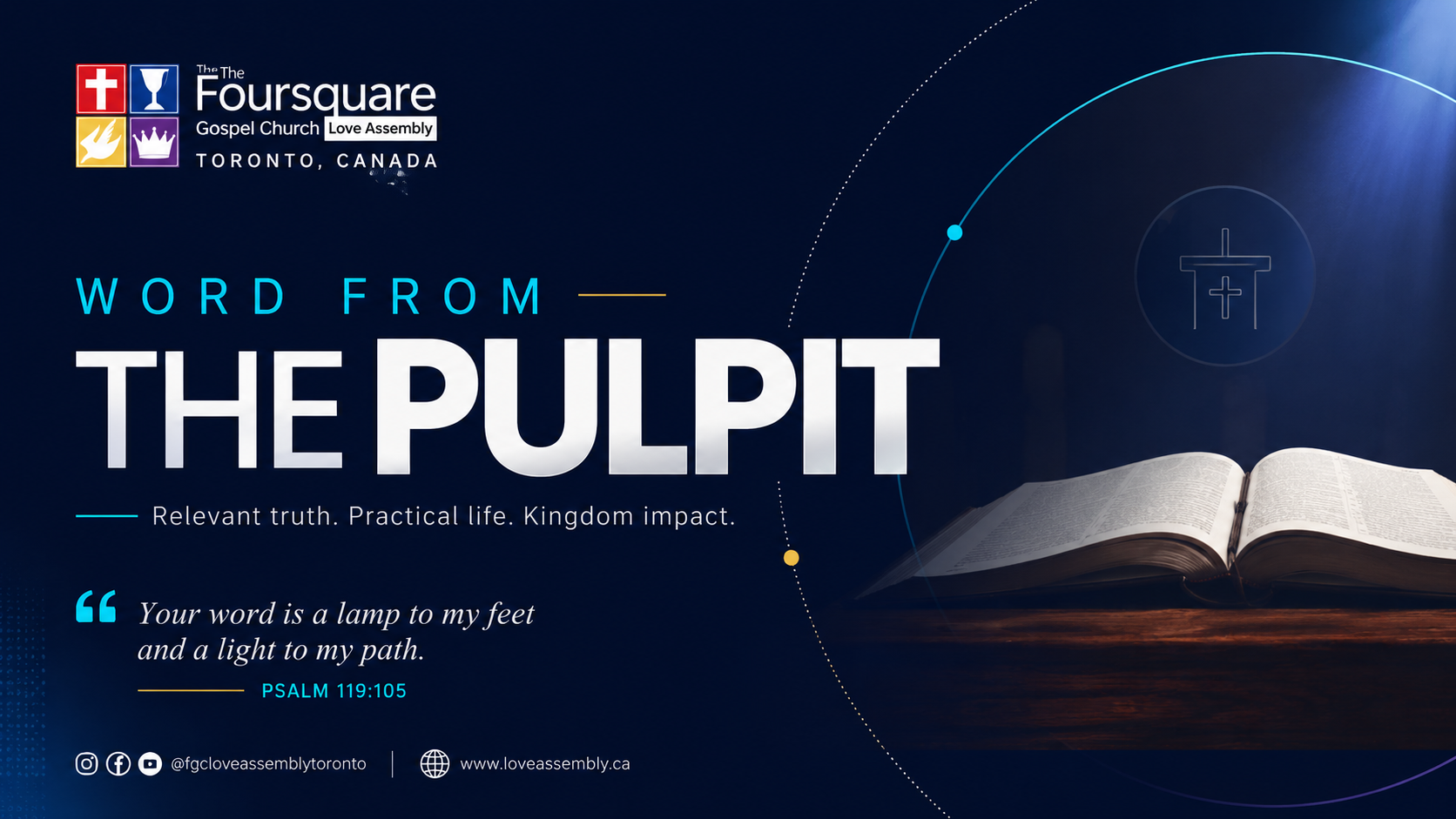
Community & Event Graphics
Event visuals, sermon systems, and digital flyers designed with clarity and energy.
A curated selection of church and community graphics designed across different themes, audiences, and formats. The work explores layout hierarchy, adaptable visual systems, typography, and communication-focused design.


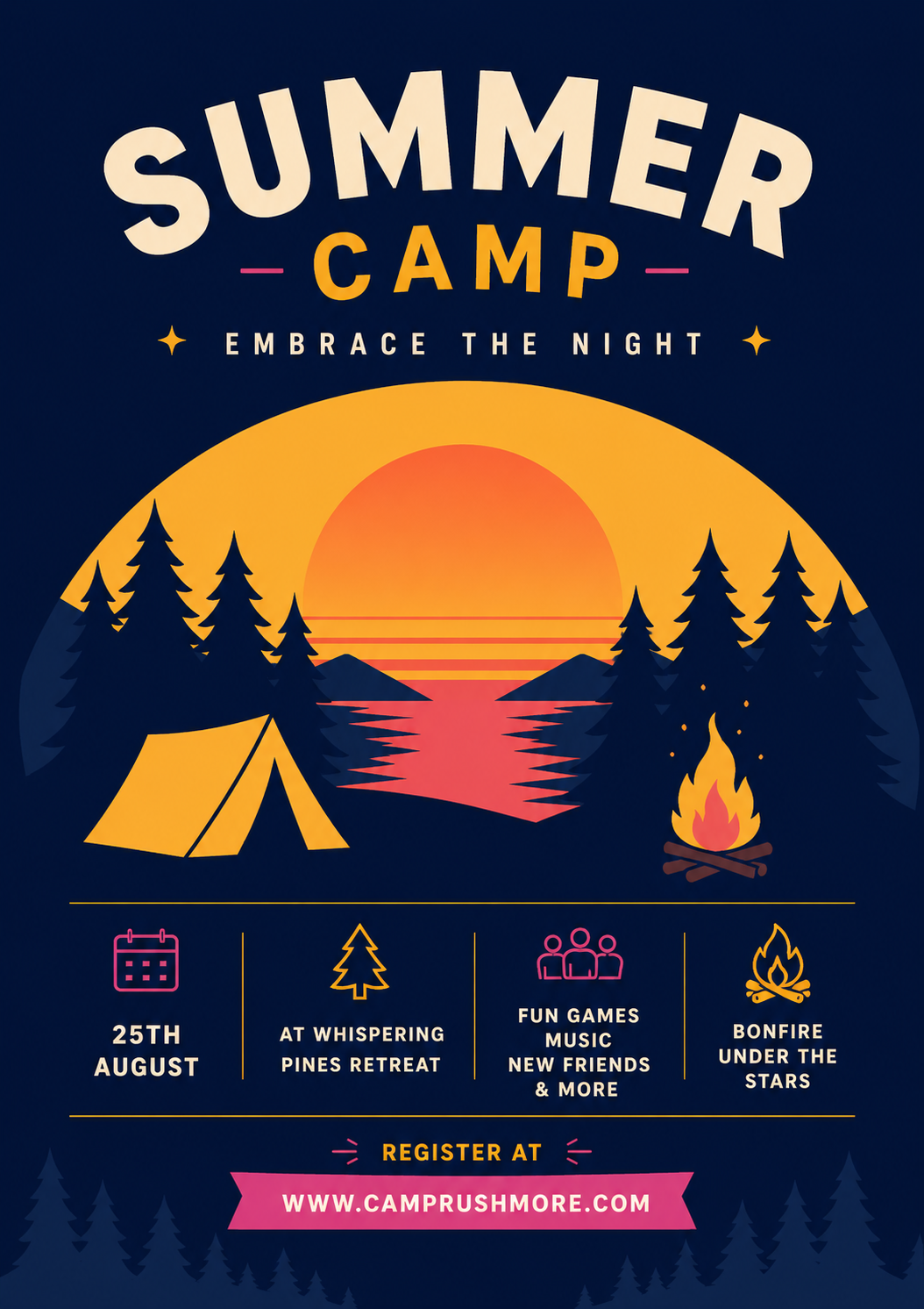
Poster Explorations
Visual experiments using atmosphere, contrast, composition, and graphic rhythm.
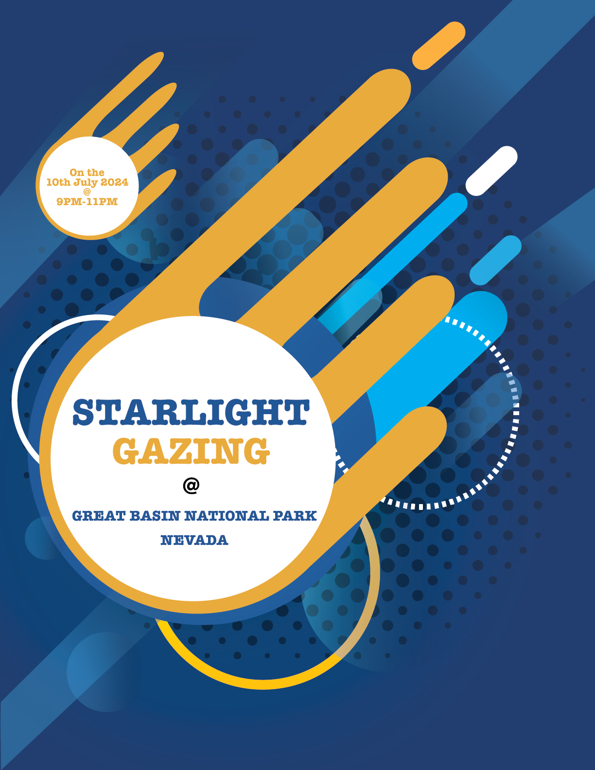
Atmosphere / Graphic Form
Poster studies exploring mood, shape, hierarchy, and visual storytelling.
These pieces are treated as visual studies rather than full case studies. They show composition, mood, scale, colour, and how a poster can create a strong feeling quickly.
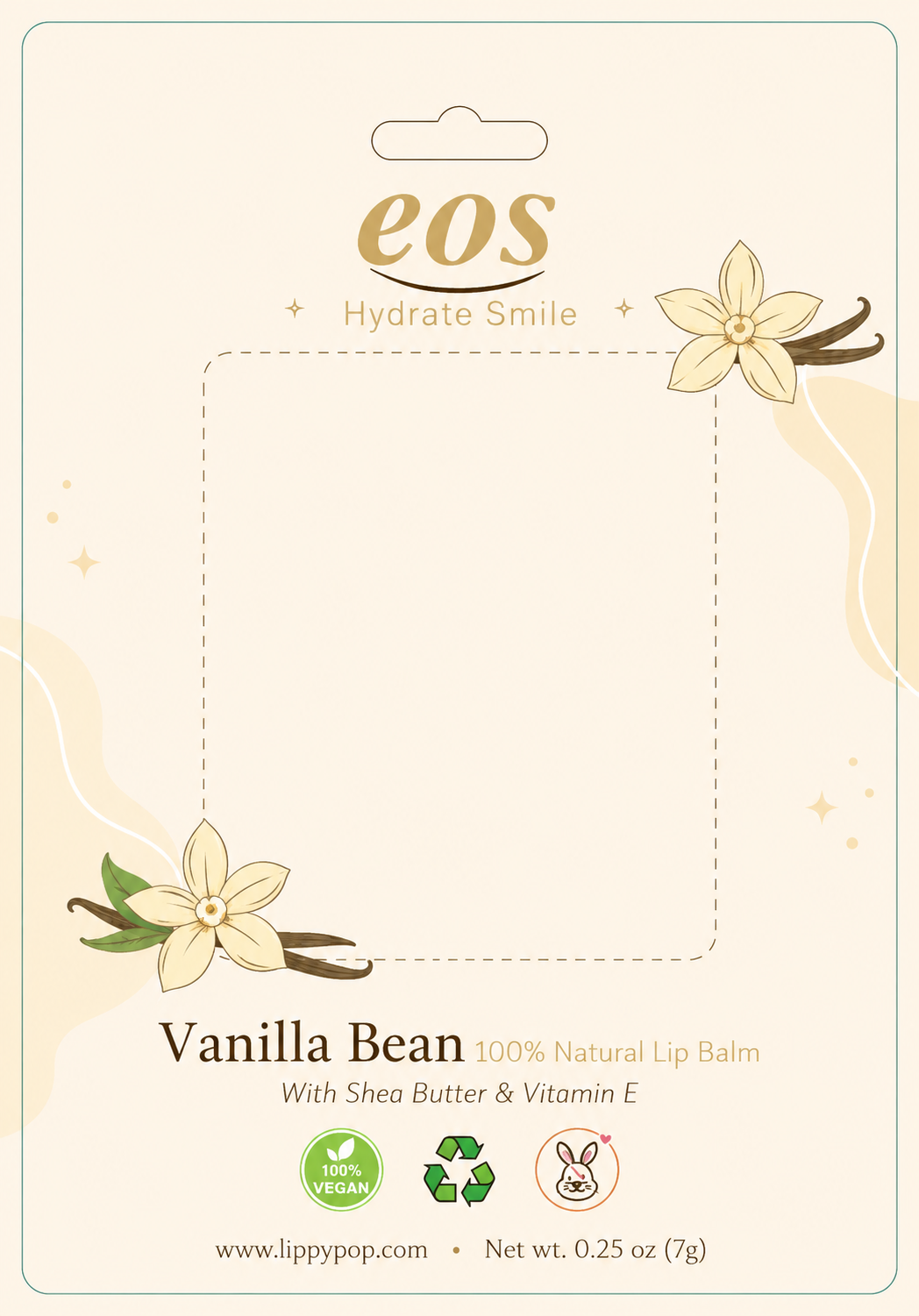
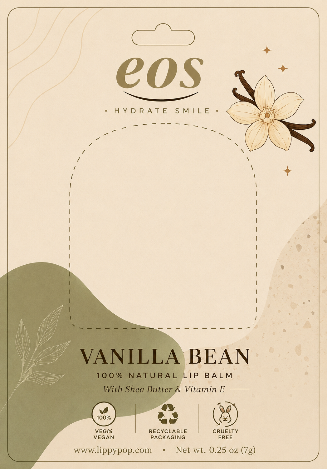
Packaging & Print Studies
Small-format packaging studies focused on softness, structure, and shelf presence.
Supporting print and packaging explorations showing how layout, illustration, product information, and brand tone can work together across a physical retail format.
Retail Format / Soft Product Design
Two backer card directions built around gentle colour, botanical detail, and clean product hierarchy.
These pieces show a softer side of the portfolio through cosmetic packaging, delicate illustration, product information, and restrained layout decisions.
Personal Identity Explorations
A.T logo studies exploring contrast, simplicity, and personal brand presence.
A small set of personal identity explorations built around my initials. The goal was to create a mark that feels clean, flexible, and personal while still fitting the premium editorial tone of my portfolio.
Ongoing Practice
Small studies that sharpen the bigger work.
These explorations represent the smaller visual experiments, quick-turnaround graphics, and design studies that continue to shape my approach to branding, layout, typography, and communication. While they are not full case studies, they show range, curiosity, and a consistent interest in creating strong visual systems across different formats.
View full case studies