Dark, tense, cinematic, controlled.
Typography / Movie Poster / Typeface Design
The Equalizer
A custom display typeface and type-heavy movie poster inspired by The Equalizer. The project explores justice, balance, precision, and control through sharp geometric letterforms, bold hierarchy, and a dark cinematic poster system.
Cinematic Typography
Poster System
Visual Tension
Controlled Atmosphere
Custom Letterforms
Hierarchy Study
Create a poster system where typography carries the mood, concept, and hierarchy.
Custom letterforms, sharp geometry, strong spacing, atmosphere, and scale.
Final poster, alternate poster, typeface system, stroke library, and process layouts.
Project Overview
A poster built through tension, precision, and typographic restraint.
The Equalizer poster explores how typography can create a cinematic feeling without relying on heavy imagery. The design uses scale, spacing, sharp structure, and controlled contrast to build a dark, thriller-inspired mood.
The custom type direction was developed to feel precise, intense, and deliberate, supporting the themes of justice, balance, control, and calculated action.
Tension
Justice
Precision
Control
Hierarchy
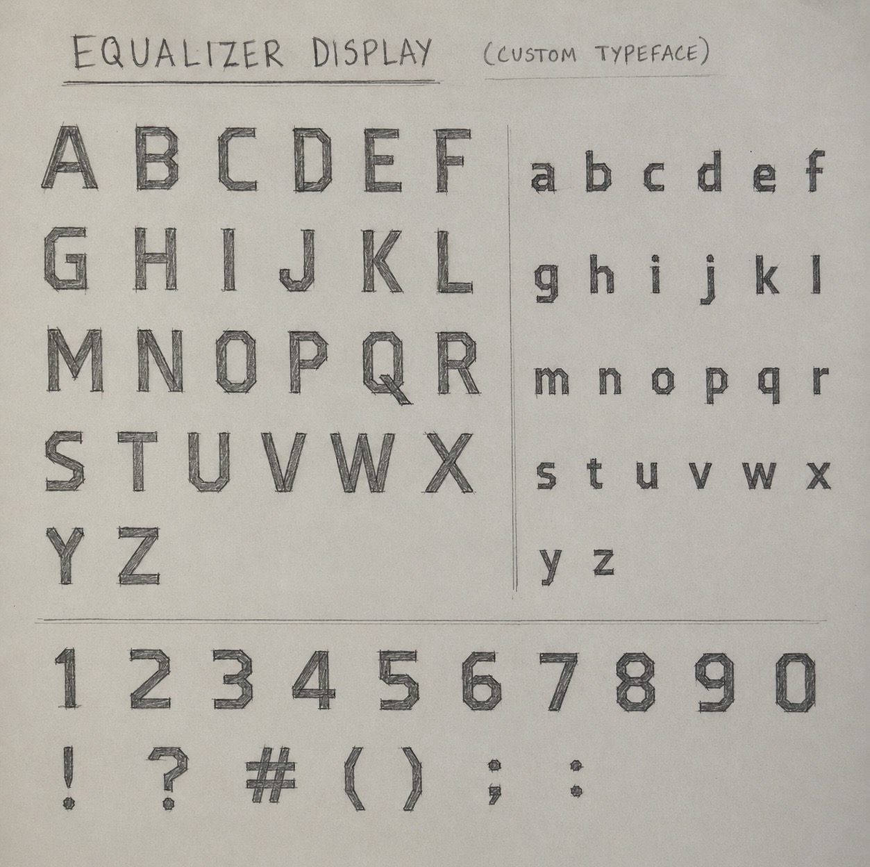
Typeface Concept
Sharp cuts, heavy geometry, and controlled spacing shaped the letterforms.
The typeface uses sharp cuts, heavy geometric forms, and controlled spacing to reflect the film’s themes of precision, justice, and calculated action.
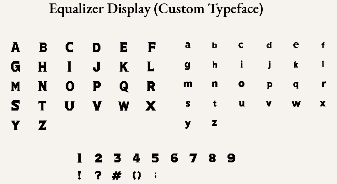
Stroke Library
A small set of strokes built the visual language of the typeface.
The type system was built from a small stroke library: verticals for strength, horizontals for balance, diagonals for action, curves for control, and clock-hand forms for precision.

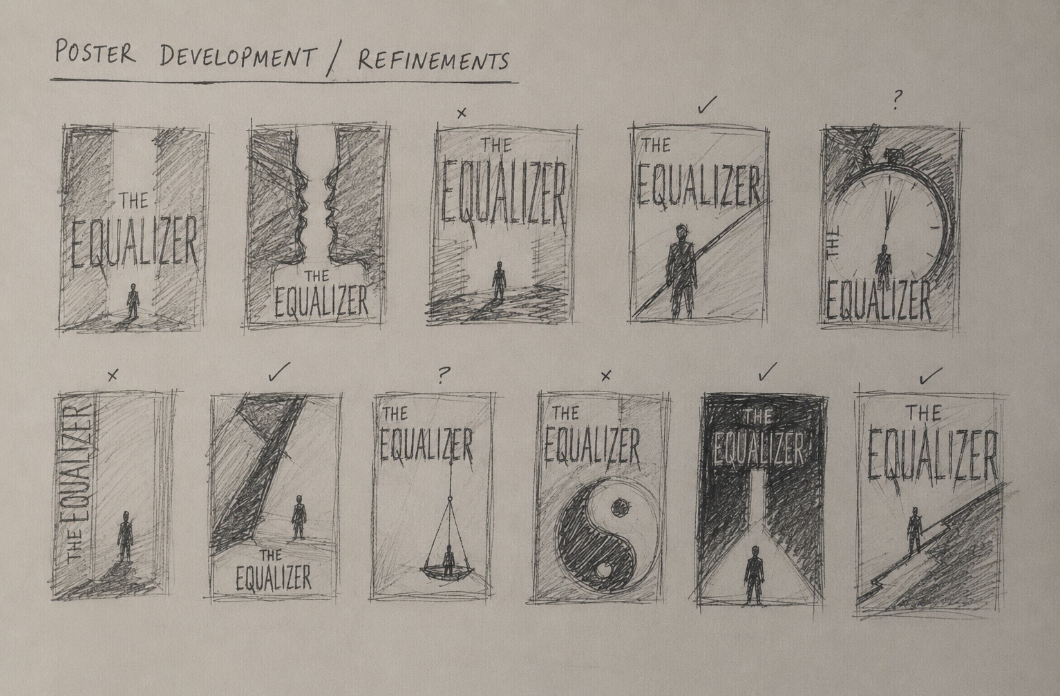
Poster Development
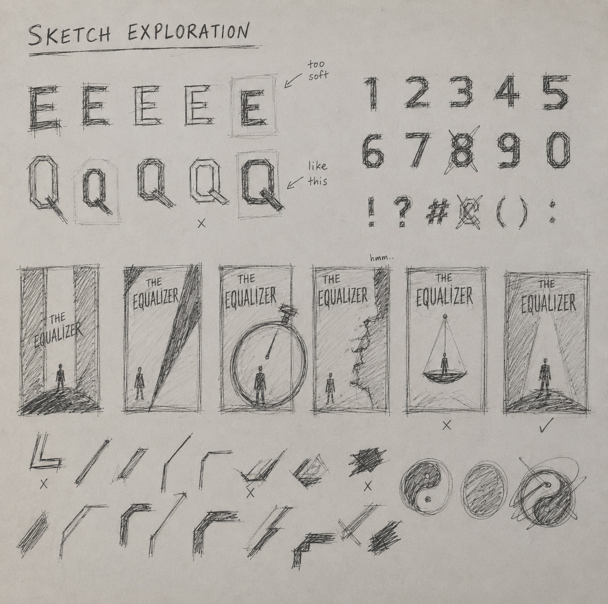
Early sketches and refinements focused on consistency, rhythm, and tension.
 01
01
Sketch exploration
Early sketches tested sharp silhouettes, tension, and type-led poster ideas.
 02
02
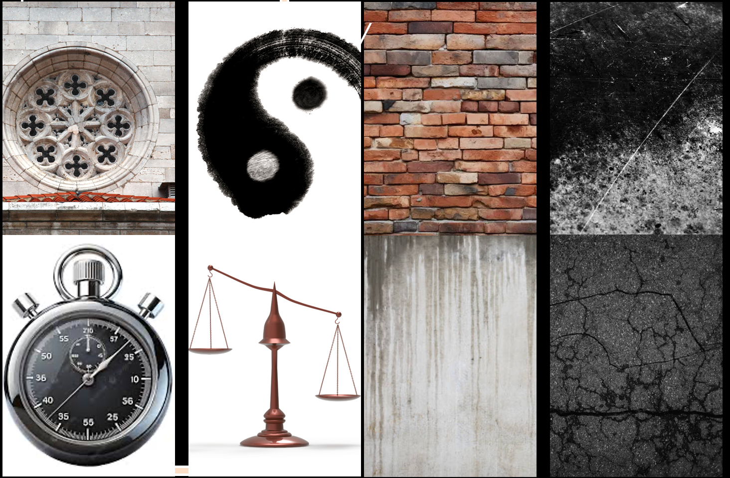
Moodboard / Visual Direction
Visual references explored precision, structure, tension, and cinematic darkness to shape the typeface and poster direction.
 03
03
Poster refinement
The final layout was refined through hierarchy, scale, darkness, and atmosphere.
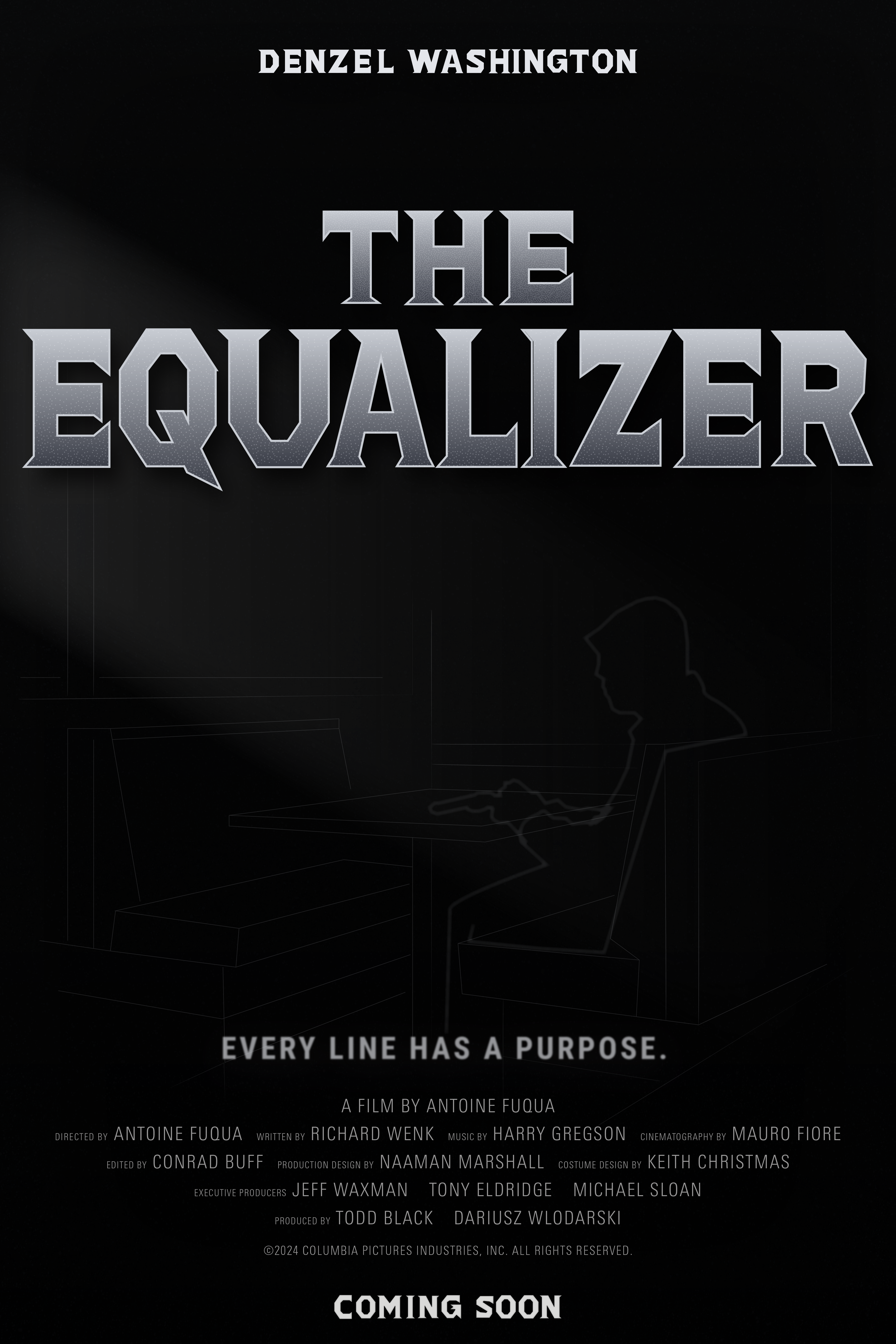
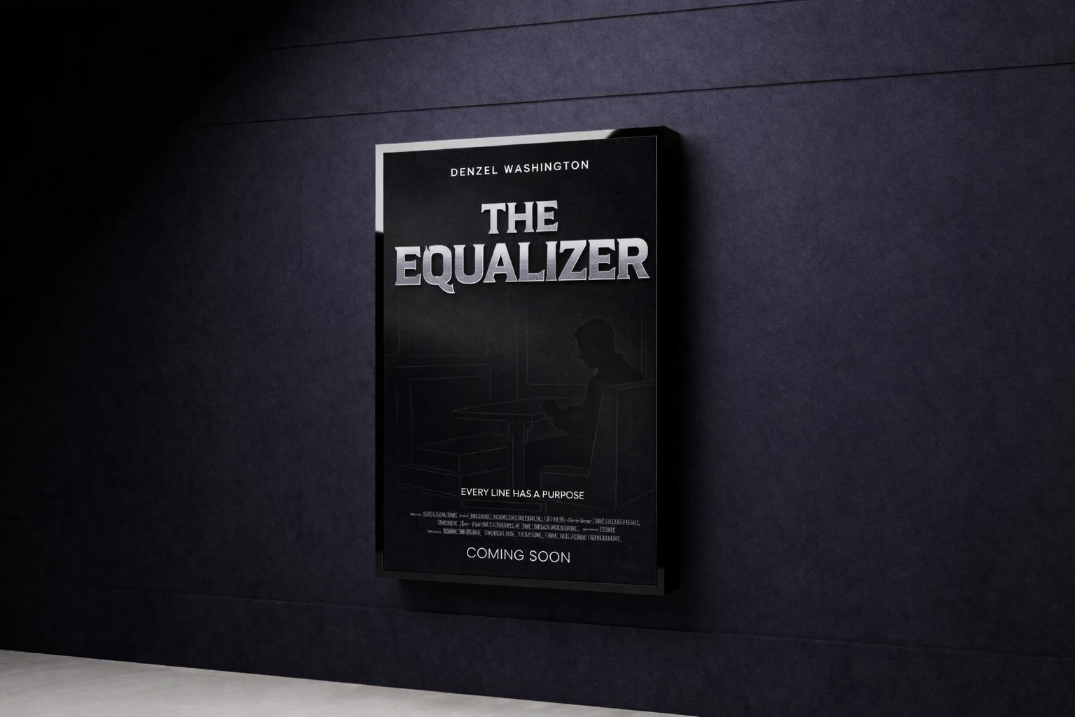
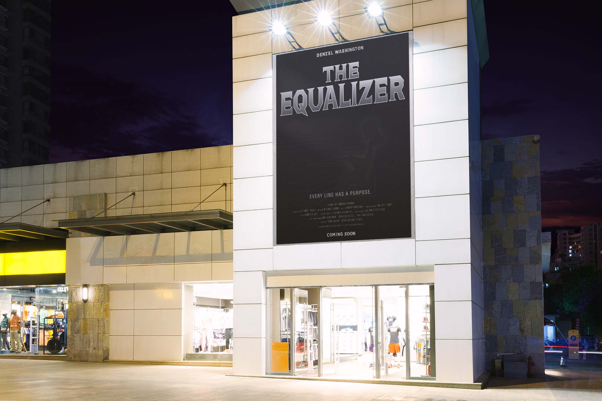
Final Poster
The final poster uses custom typography as the main visual element.
The final poster uses the custom typeface as the main visual element, supported by a dark noir atmosphere, subtle linework, and a strong type hierarchy.
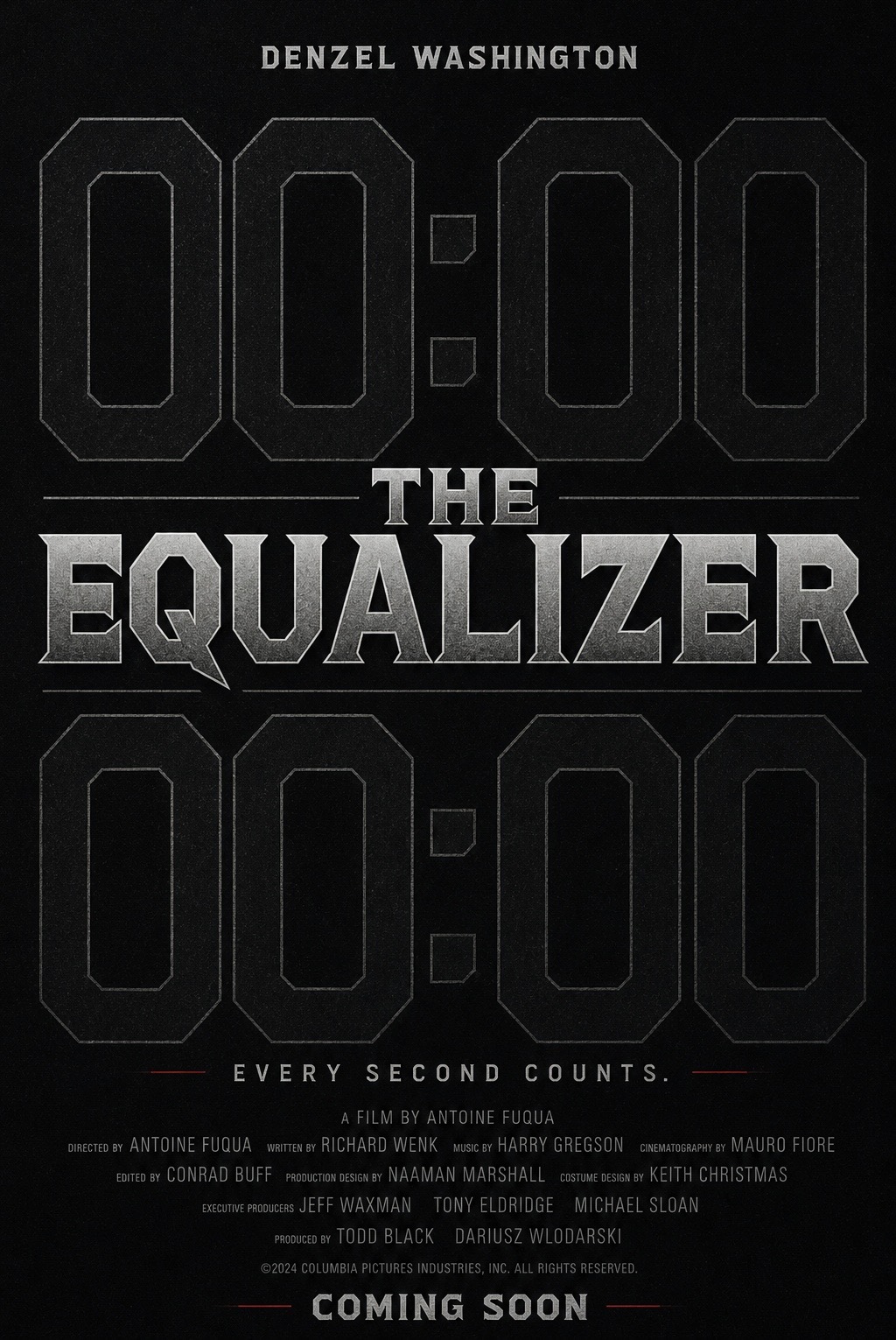
Alternative Poster
An alternate direction focused on time, precision, and quiet tension.
An alternate poster explores time and precision more directly, using numbers, spacing, repetition, and minimal typography to create tension without relying on imagery.
Direction
Time / Precision
Black background, large timing marks, repeated small type, and restrained spacing create a colder, quieter poster system.
Final Direction